Color
Color principles, palette, application, light and dark mode considerations in Garden.
Principles
Purpose
In the user interface, color carries specific meaning and sets consistent user expectations. Use red, green, and yellow to provide status feedback like success, warning, or danger. Limit their application to avoid clutter. Utilize blue to emphasize interactive elements.


- Use appropriate hue to communicate function

- Don’t use hue that is not aligned with the expected action.
Hierarchy
Color is a powerful tool for presenting the hierarchy of elements on a screen. It helps highlight key elements that require interaction and dim the secondary ones.
Primary color (blue) is dedicated to buttons, links, and selection states. Neutral shades (grey) are commonly used for non-interactive foregrounds, backgrounds, and borders (except for validation cases). This distinction helps users easily understand which areas on the screen are responsible for completing a task. Supplement colors with text and icons to emphasize hierarchy and relevance.


- Draw user’s attention to only what is important to achieve their goals

- Don’t use color to decorate or to distract users
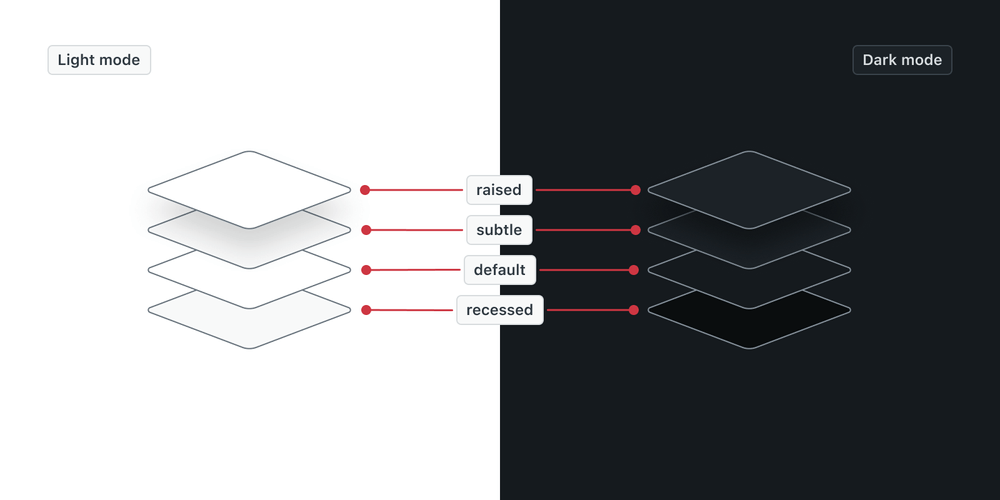
Elevation
A common practice is to communicate element hierarchy through levels. To present the spatial relationships between elements, Garden uses color, shadows, backdrops, borders, and fills.
| Depth | Usage |
|---|---|
recessed | Surfaces that sit below the main surface (Well) |
default | Main background surfaces |
subtle | Surfaces that are positioned on the main surface and need to be emphasized (Alert). |
raised | Surfaces that are floating above the main surface (Modal, Tooltip dialog, or Notification) |


- Use color to communicate depth.

- Don’t add shadow on elements that should not be elevated.
Opacity
Colors with opacity applied help visually indicate layering of elements on different backgrounds. Opacity is primarily used for colors in backgrounds and follows predefined values. Interactive elements (Basic button or Table) are good examples where opacity can be applied.

- Use opacity to layer colors together.

- Don’t use opacity in a way where other elements will become unusable.
Accessibility
Remember not to rely solely on color to indicate the state or status of a component. Use text or icon to support the visual affordance. The most effective measure of the color accessibility is the contrast ratio (regulated by WCAG guidelines). It refers to the difference in luminance, or brightness, between foreground and background color. Text should always conform to 4.5:1 color contrast or higher, while graphical elements (like icons) need 3:1 color contrast. This makes the interface clear even for people with color vision impairment.

- Use shades that pass color contrast requirements and provide additional visual clues outside of color

- Don’t use color alone to indicate state or status.
Palette
Overview
Each hue within the Garden palette has 12 shades with consistent contrast distribution. This means that every shade at the same value (like 500) will have an identical contrast ratio against the same background.
This approach ensures scalability of the system, theming automation, and helps with WCAG compliance. Hues in shade 600 meet minimum 3:1 color contrast requirement against white or shade 100. Hues in shade 700 meet 4.5:1 color contrast. Shades 800 and above meet 7:1 or higher color contrast.
Primary
Primary colors are used for the structure of interfaces, actionable items, and validation.
| Color | 100 1.02:1 | 200 1.2:1 | 300 1.35:1 | 400 1.99:1 | 500 2.79:1 | 600 3.25:1 | 700 4.99:1 | 800 9.99:1 | 900 12.5:1 | 1000 16.01:1 | 1100 17.52:1 | 1200 19.5:1 |
|---|---|---|---|---|---|---|---|---|---|---|---|---|
| Grey | #f8f9f9 | #e8eaec | #d8dcde | #b0b8be | #919ca5 | #848f99 | #5c6970 | #39434b | #293239 | #1c2227 | #151a1e | #0a0d0e |
| Kale | #ecf9f9 | #daeded | #cbe2e1 | #97bfbf | #6ba4a5 | #4a9999 | #40787a | #16494f | #063940 | #03252a | #061517 | #060e0e |
| Blue | #edf7ff | #ddecf8 | #cce0f1 | #93bcdc | #66a0cd | #2694d6 | #1f73b7 | #13456d | #0f3655 | #0a2338 | #061420 | #040d15 |
| Green | #eef8f4 | #daeee6 | #cae3d9 | #94c1b0 | #4eab89 | #26a178 | #037f52 | #104b35 | #0b3b29 | #0c261c | #0a1511 | #080d0c |
| Red | #fff2f3 | #fee3e5 | #f5d5d8 | #f2a1a8 | #ea7881 | #eb5c69 | #cd3642 | #7e1d25 | #671219 | #3d1418 | #1d1011 | #100b0c |
| Yellow | #fff3e4 | #ffe6cb | #fed6a9 | #fca347 | #e38215 | #d67305 | #ac5918 | #673515 | #4c2c17 | #2d1e15 | #18120f | #0e0c0b |
Secondary
Secondary colors are used in supplementary interface elements such as icons, tags, status badges, and illustrations.
| Color | 100 1.02:1 | 200 1.2:1 | 300 1.35:1 | 400 1.99:1 | 500 2.79:1 | 600 3.25:1 | 700 4.99:1 | 800 9.99:1 | 900 12.5:1 | 1000 16.01:1 | 1100 17.52:1 | 1200 19.5:1 |
|---|---|---|---|---|---|---|---|---|---|---|---|---|
| Purple | #f9f3fb | #f2e7f6 | #e9d8f1 | #d0a9e0 | #bb86d3 | #b276cd | #9256b1 | #58209a | #411973 | #2e1150 | #230d3f | #120720 |
| Royal | #f4f5fc | #e7e9f8 | #d8dcf4 | #acb4e7 | #8a96dd | #7a88d9 | #4c67d3 | #1833ab | #122680 | #0d1a5a | #0a1445 | #050a25 |
| Fuschia | #fbf3f8 | #f7e6f1 | #f2d5e7 | #e3a4cc | #d77db7 | #d16aac | #b34496 | #78116c | #5a0d51 | #3f0939 | #31072c | #1b0418 |
| Azure | #eff7fe | #d9ecfc | #c4e0fa | #82bcf4 | #4b9fee | #3191ea | #2770c3 | #23446b | #1a3250 | #122238 | #0e1a2a | #070d14 |
| Pink | #fcf3f4 | #f7e5e8 | #f3d6dc | #e5a6b4 | #d98193 | #d96b81 | #d62054 | #75263d | #561d2e | #3c141f | #2e0f18 | #17080c |
| Teal | #d4fefa | #88fdf1 | #0bf8e1 | #03cdb8 | #02ad9c | #2a9d8f | #367a74 | #254846 | #1b3534 | #122423 | #0e1c1a | #070d0d |
| Crimson | #fbf3f2 | #f7e7e4 | #f1d7d2 | #e2aaa0 | #d58678 | #cf7464 | #be4938 | #811b12 | #61140d | #440e09 | #340b07 | #1c0604 |
| Mint | #d6ffeb | #9affce | #0afe89 | #00d26d | #01b15c | #16a260 | #2d7e55 | #1b4b33 | #143726 | #0e261a | #0b1d14 | #050e0a |
| Orange | #fdf3ed | #fae7d8 | #f7d7be | #eda875 | #e58035 | #d57428 | #af5626 | #693317 | #4d2711 | #361a0c | #291409 | #150a04 |
| Lime | #ecfae7 | #d1f3c7 | #b3eda3 | #4fd12b | #45b025 | #509f2d | #3d7e19 | #2c491b | #203614 | #16250e | #111d0a | #090e05 |
| Lemon | #fff7d4 | #ffea97 | #ffdc4f | #efab00 | #c79100 | #b68500 | #8f6900 | #563e00 | #3f2e00 | #2b2000 | #221800 | #110c00 |
Application
Primitive and semantic variables
In a design system, variables define values that you can reuse between different elements. This ensures consistency, scalability, and easier maintenance of a design system. Garden distinguishes two levels of color variables which serve distinct but complementary purposes:
-
Primitive variables represent the option level, as the most basic, fundamental values in a design system. Their name describes the visual attributes or represent basic values included in the color palette (like
red-500orblue-100). They are a source for higher-level variables and are not applied directly to components. -
Semantic variables are built on top of the primitive variables and represent the context level. Their name is descriptive. It carries intended use or meaning rather than appearance (like
border.warning). Garden uses semantic variables in components, as the only ones supporting theming.

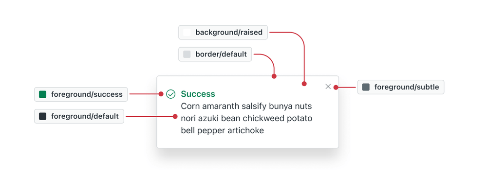
Taxonomy
Taxonomy is a structured classification system to help understand, apply, and create variables. Variable names are composed from different parts, starting from generic to specific (Application → Group → Element → Modifier → State).
- Application describes the type of variable (
color) - Group describes if a variable is part of an object group (
chromeortag) - Element describes where the variable is applied (
background,foregroundorborder) - Modifier describes variant or prominence (
primary,defaultoremphasis) - State describes interaction (
hoveroractive)
| Variable examples | Description |
|---|---|
color.border.success.emphasis | Strong success border color applied to Input |
color.chrome.foreground.default | Default text color applied in a Chrome component |
color.background.primary.hover | Hover background color applied to a Primary button |
Always aim to simplify variable names and avoid overspecification. Optimize
variable names for people using them. Use camelCase or . when stitching
parts together to separate categories. Keep in mind that variables might follow
different best practices whether they are implemented in code or in Figma.
Guidelines
Garden’s variable color collection set is designed to remain compact, readable, and reusable. Color variables are grouped into three main categories indicating where they are applied:
- Foreground is used for text and icons
- Background is used for fill areas
- Border is used for different types of interactive and non-interactive borders
Each of the main categories is supplemented by a modifier that specifies information regarding variant or prominence:
Primarycolor is used for interactive and actionable elements, such as Anchor, Button, focus indicators, table selection and more.Success,WarningandDangerare used to emphasize different types of information, such as danger buttons, input validation, Notifications or Alerts.Defaultoften denotes the most used value, withSubtleorEmphasisadditions to cover a wider range of specific use cases.
Semantic naming is consistent in Figma and in code Hover and Active states
programmatically change color by 100 or 200
shade offset from the base hue. Temporary or supporting variables in Figma are
marked with an asterisk *.
Foreground
Background
Borders
Shadows
Custom variables
If there is a need to create custom variables, always build upon the taxonomy that exists. Use terms that system consumers are familiar with.
Theming
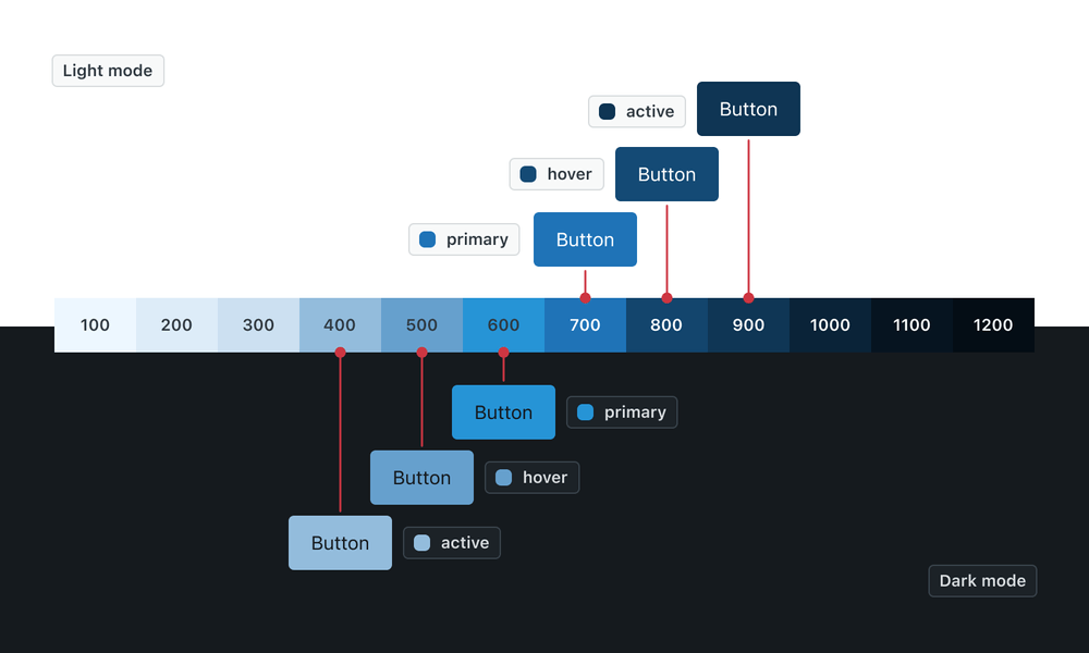
Differences in application
Light mode uses shade 700 as the prevailing shade and dark mode uses shade 600. This change makes the actionable elements stand out in the dark environment. Both shades provide comparable color contrast. Color shades primarily used in dark mode tend to have less saturation to prevent light bleed. Actionable elements with filled backgrounds have dark text to reduce eye fatigue.
Interaction
Interaction states in light mode increase the shade number (hover is darker than base hue), while dark mode does the opposite (hover is lighter than base hue). Light and dark modes automatically increase/decrease shades to account for this.
Elevation
Modes differ in their approach to presenting surface elevations. In light mode default and raised surfaces are lighter than recessed and subtle surfaces. Dark mode surfaces that appear closer to the light source use a lighter tint. Recessed surfaces that are further from the light source use a darker shade.
In both modes the raised surface casts a shadow. Small shadows are used for Tooltip only. Medium shadows are used for components without backdrop (Tooltip dialog, Menu). Large shadows are used for components that have a backdrop (Modal or Drawer).
Opacity
Opacity values are consistent in both light and dark mode. Light mode uses shade 700 and dark mode uses shade 500 as the primary shade.