Garden 9 is now available.
The website has been updated to the latest major version. View previous versions
Skip to main content
Design
Components
Patterns
    • Introduction
      • Overview
    • Foundations
      • Bedrock CSS
      • Design tokens
      • Containers
      • Theming
      • Versions
    • Components
      • Accordion
      • Anchor
      • Avatar
      • Breadcrumbs
      • Buttons
      • Chrome
      • Code block
      • Color picker
      • Color swatch
      • Date picker
      • Draggable
      • Drawer
      • Forms
        • Checkbox
        • Combobox
        • File upload
        • Input
        • Input group
        • Radio
        • Range
        • Select
        • Textarea
        • Toggle
      • Grid
      • Loaders
      • Menu
      • Modal
      • Notification
      • Pagination
      • Pane
      • Sheet
      • Status indicator
      • Stepper
      • Table
      • Tabs
      • Tags
      • Tiles
      • Timeline
      • Tooltip
      • Tooltip dialog
      • Typography
      • Well
    Table of Contents
    • How to use it
      • Default
      • Disabled
      • Hidden label
      • Hint text
      • Indeterminate
      • Regular weight label
      • Validation
    • How to use it well
      • Use to select any number of options
    • Configuration
    • API
      • Checkbox
      • Field

    Checkbox

    A Checkbox lets users select and unselect options from a list.


    Table of Contents
    • How to use it
      • Default
      • Disabled
      • Hidden label
      • Hint text
      • Indeterminate
      • Regular weight label
      • Validation
    • How to use it well
      • Use to select any number of options
    • Configuration
    • API
      • Checkbox
      • Field

    Used for this
    • To let users compare options from a list and select all, any, or none of those items
    • To turn a single option on or off
    Not for this
    • To give the user a mutually exclusive choice, use the Radio component instead
    • To let users activate an option that takes effect immediately, use a Toggle instead

    How to use it

    Default

    A Checkbox’s label is part of its touch target.

    Toggle dark mode
    Set primary hue
    Toggle RTL
    Open in CodeSandbox
    Copy code
    View code

    Disabled

    A disabled Checkbox prevents user interaction. It doesn’t appear in the tab order, can’t receive focus, and may not be read aloud by a screenreader.

    Toggle dark mode
    Set primary hue
    Toggle RTL
    Open in CodeSandbox
    Copy code
    View code

    Hidden label

    Checkbox labels can be hidden.

    Toggle dark mode
    Set primary hue
    Toggle RTL
    Open in CodeSandbox
    Copy code
    View code

    Hint text

    Use Hint to add more context to the label.

    Toggle dark mode
    Set primary hue
    Toggle RTL
    Open in CodeSandbox
    Copy code
    View code

    Indeterminate

    If the children of a Checkbox have different states (some on, some off) the parent Checkbox will show an indeterminate state.

    Toggle dark mode
    Set primary hue
    Toggle RTL
    Open in CodeSandbox
    Copy code
    View code

    Regular weight label

    Checkbox labels are bold by default, but they can be regular weight too.

    Toggle dark mode
    Set primary hue
    Toggle RTL
    Open in CodeSandbox
    Copy code
    View code

    Validation

    Show success, warning, and danger validation messages with the Message component.

    Toggle dark mode
    Set primary hue
    Toggle RTL
    Open in CodeSandbox
    Copy code
    View code

    How to use it well

    Use to select any number of options
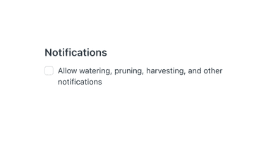
    Do this

    Use to turn a standalone setting on and off, as a favorable alternative to a Toggle.
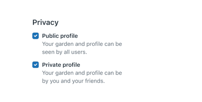
    Not this

    Don’t use to select exactly one option from a set of two or more. Use Radios instead.

    Configuration

    • Name9.5.3•View source•View on npm
    • Installnpm install @zendeskgarden/react-forms
    • Depsnpm install react react-dom styled-components @zendeskgarden/react-theming
    • Importimport { Checkbox, Field } from '@zendeskgarden/react-forms'

    API

    The Checkbox component follows this structure:

    <Field>  <Checkbox>    <Field.Label />    <Field.Hint />  </Checkbox>  <Field.Message /></Field>

    Checkbox

    Extends InputHTMLAttributes<HTMLInputElement>

    Nest a Checkbox within a Field component.

    Prop nameTypeDefaultDescription
    indeterminate
    boolean

    Sets the checkbox state to indeterminate

    isCompact
    boolean

    Applies compact styling

    Field

    A Field provides accessibility attributes to its child Checkbox field by associating it with the corresponding Field.Label and Field.Hint.

    Field.Hint

    Extends HTMLAttributes<HTMLDivElement>

    Nest the Hint within the Checkbox component.

    Field.Label

    Extends LabelHTMLAttributes<HTMLLabelElement>

    Nest the Label within the Checkbox component.

    Prop nameTypeDefaultDescription
    hidden
    boolean

    Hides the label visually without hiding it from screen readers

    isRegular
    boolean

    Applies regular (non-bold) font weight

    Field.Message

    Extends HTMLAttributes<HTMLDivElement>

    The Message component applies appropriate icon and styles based on the validation provided. Nest it within a Field component.

    Prop nameTypeDefaultDescription
    validation
    'success' | 'warning' | 'error'

    Applies validation state styling

    validationLabel
    string

    Defines the aria-label for the validation icon

    Garden is the design system by Zendesk.
    BlogGitHubVersions
    © Zendesk 2025