Copy
The copy action provides the user the ability to copy a value from an input field or other areas within the interface. It temporarily stores information that can be retrieved and used within a given flow.
Anatomy
- Always include the value being copied and the copy action which can be represented as a Button or an Icon Button
- When the field label is unavailable, it is recommended to use the Tooltip component on the action to reinforce the type of information being copied
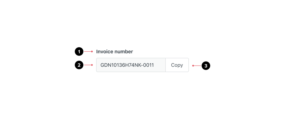
- Label of the value being copied. Ensure a label is visible in the interface however it can be visually hidden if required.
- Actual value that will be copied
- Copy action
Related components
Layouts
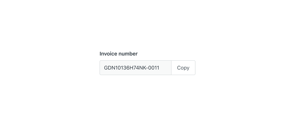
Default
- Use an Input group to enable the copy action within forms
- If the data being copied is read-only, use a read-only Input group
- Use a medium-sized default button for copy actions and place the button to the side of the input field
Minimal
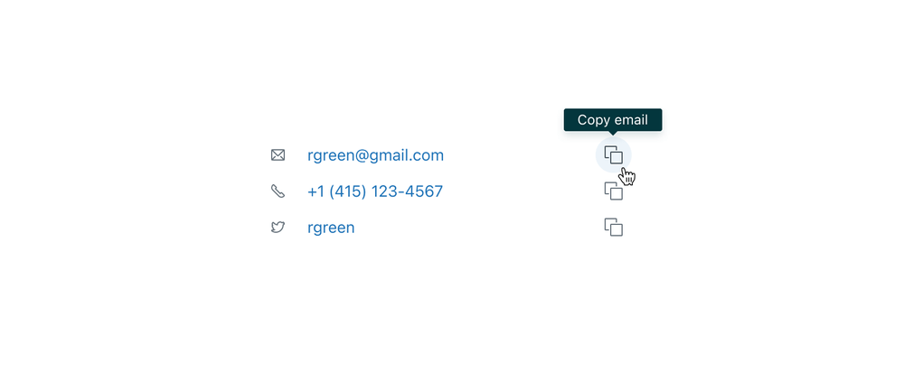
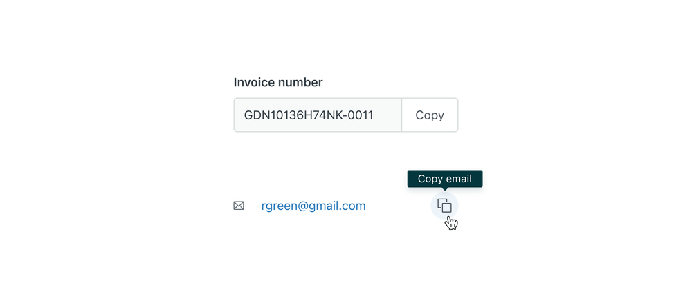
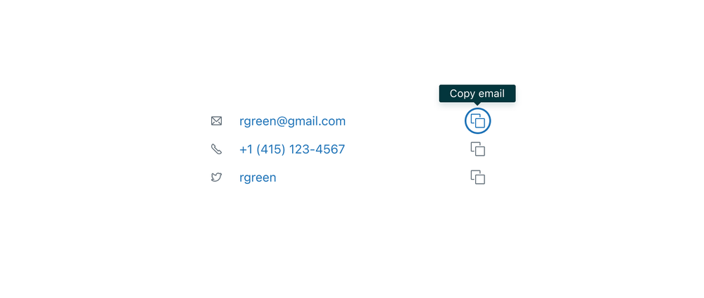
Copy interaction can be also found in a more minimal style, for example in list items within cards. The label in that case would not be visible, or it might have an icon at the start to indicate the field type. The copy action would be to the side of the item as an Icon button.

Content
- For Input groups, use “Copy” as the visible button label
- For Icon buttons, include the object as part of the Tooltip content
- If there are multiple copy buttons on a page or view, ensure the appropriate ARIA or alt attributes are added
Flows
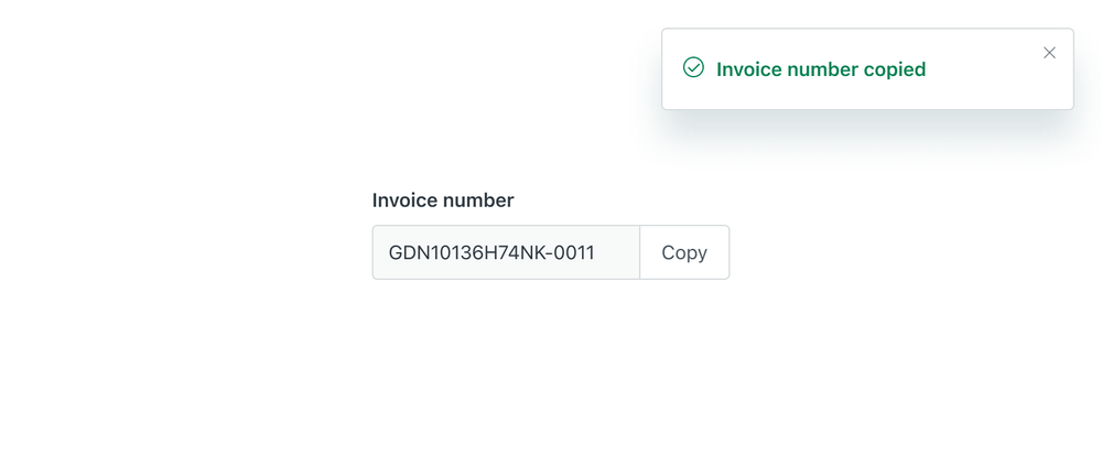
After the interaction, provide feedback with a success Notification. Notifications should remain on screen for at least 5 seconds.
Localization & internationalization
The copy action should appear on the right side of the Input field for LTR (left-to-right) languages and on the left side for RTL (right-to-left) languages.
Different languages can also affect the copy label length so ensure adequate space is considered within the Input field.
Accessibility
Default


- Use the read-only Input field in forms

- Don’t use the disabled Input field
Minimal
When the copy interaction is used in a list, make sure that the interaction is discoverable by using the copy icon inside an Icon button and provide a Tooltip on hover or focus.
Alt text
In the example above, the icon text label and copy button text label should match. The email icon will have alt
text as “email” and the copy Icon button will say “Copy email”.
ARIA attributes
If there are multiple copy fields on a page or view within a form, use the aria-label attribute within the
“Copy” button to match the fields name.
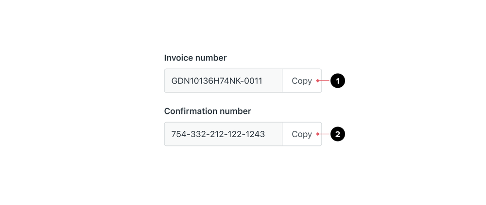
<button aria-label="Copy invoice number">Copy</button><button aria-label="Copy confirmation number">Copy</button>