Rich-text editor
A rich-text editor lets a user edit and format text using a “what-you-see-is-what-you-get” (WYSIWYG) editing area.
Anatomy
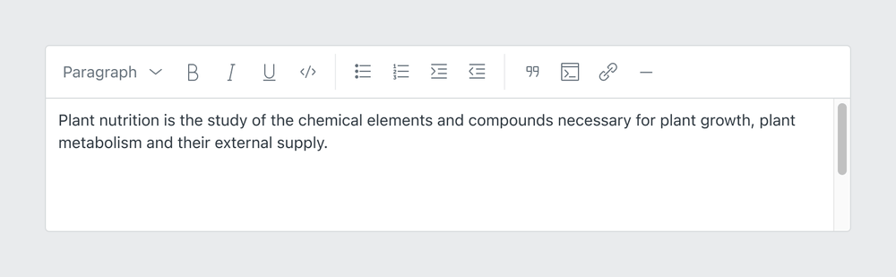
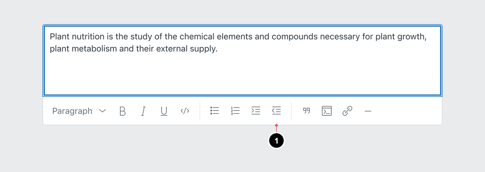
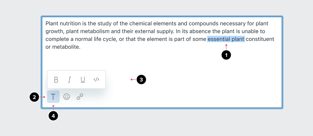
A Rich-text editor (RTE) can be used for writing various things such as articles, comments, and messages. The toolbar has menus and actions for controlling the appearance of text. It can also be a shortcut for adding content such as images, links, and other types of media.
Toolbar actions are designed to look and behave like Icon buttons. They should follow Icon buttons as much as possible including focus and hover states.
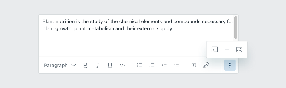
- Media button
- Media button with hidden labels
- Toggle icon button
- Icon button
- Menu
For the content inside the rich-text editor, the visual treatment should follow the defined typography styles in the toolbar.

Related components
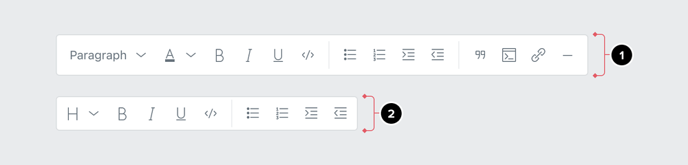
Toolbar sections
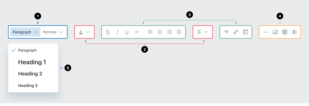
Toolbar sections have semantic meaning, so it’s important that they’re categorized by function. Toolbar can have up to 4 categories that are visually separated and appear in this order.
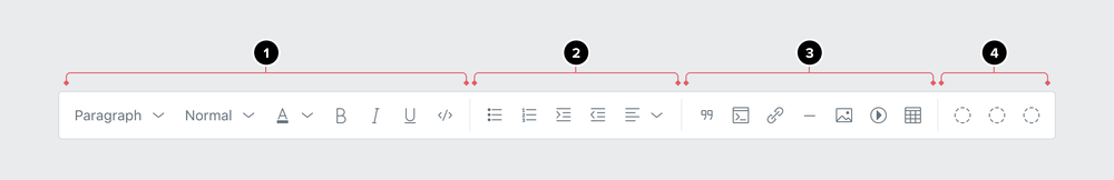
- Text formatting
- Paragraph formatting
- Insert media
- Other actions
Toolbars with only a few actions can have them grouped together without separators.
Text formatting
- Text style (Dropdown selections: Paragraph, Heading 1, Heading 2, Heading 3)
- Text size (Dropdown selections: Small, Normal, Large, Extra large)
- Text color (Dropdown selection: Color swatch)
- Bold
- Italic
- Underline
Paragraph formatting
- Code
- Bulleted list
- Numbered list
- Increase indent
- Decrease indent
- Alignment (Dropdown selections: Left, Center, Right)
Insert media
- Blockquote
- Link
- Horizontal Rule
- Code block
- Image
- Video
- Table
Other actions
- HTML Source Editing
- Emoji
Tooltips
Tooltips should be provided for every action, unless the action contains a label (for example Paragraph), following Icon button best practices.
Formatting
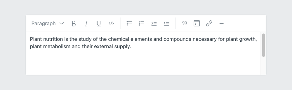
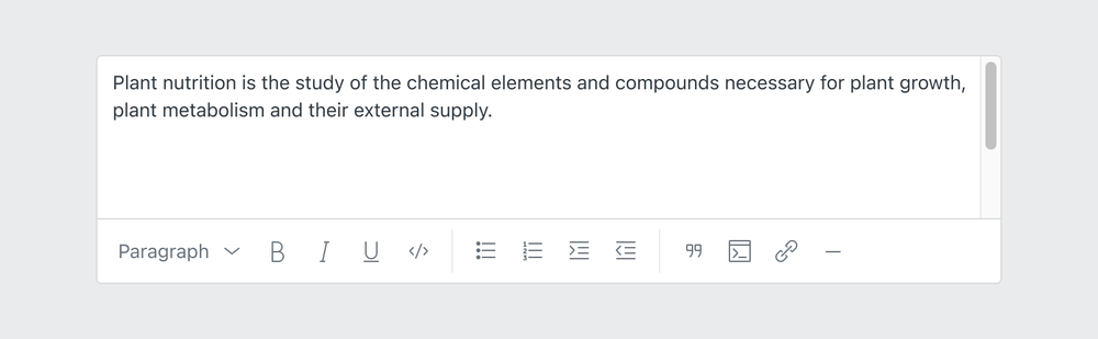
Toolbar location
When considering the placement of the toolbar, think about the size of the editing experience. For long-form writing, anchor the toolbar to the top of the editor.
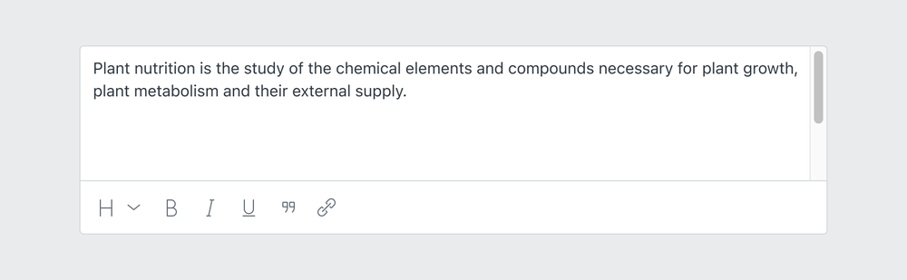
For short-form writing, the toolbar can also be anchored to the bottom of the editor.
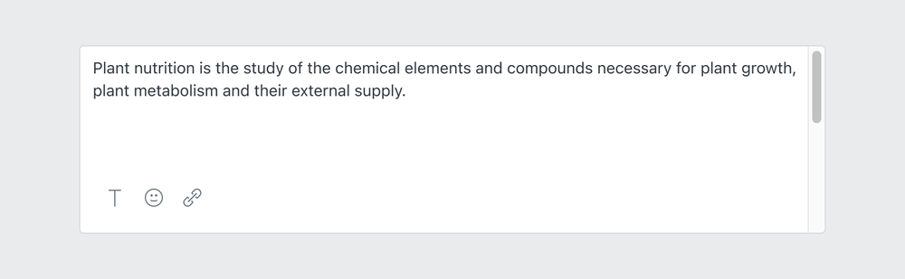
Display the toolbar in a menu when space is limited. When using a menu, provide at least 20px padding within
the textarea to prevent toolbars from covering content.

Toolbar size
Default size of the toolbar is 48px. This includes icon buttons with 8px padding in the toolbar. Compact version of
the toolbar reduces the padding to 4px with the height of the toolbar being 40px tall. The compact version is better suited
when there are certain space constraints, such as being used in a Drawer.
- Default size toolbar with
8pxpadding - Compact size toolbar
4pxpadding
Responsive behavior
Toolbar actions are responsive based on the width of the container. Icons can be used while keeping the chevron to show that there are dropdown selections.

- Media button
- Media button with hidden label
When a toolbar has many actions, the actions at the end will go into an overflow menu.
Resizable textarea
Textarea should resize vertically as the user types. The minimum and maximum height can be restricted depending on space constraints.
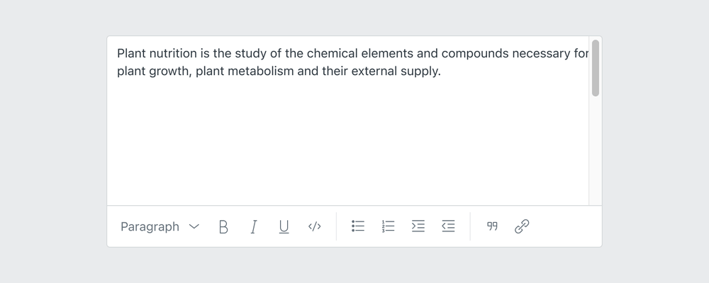
Once the maximum height of the textarea is reached, a scrollbar should appear next to it.
States
Disabled states
If a formatting option is not available for selected text, it should be disabled.
- Disabled icon button
Flows
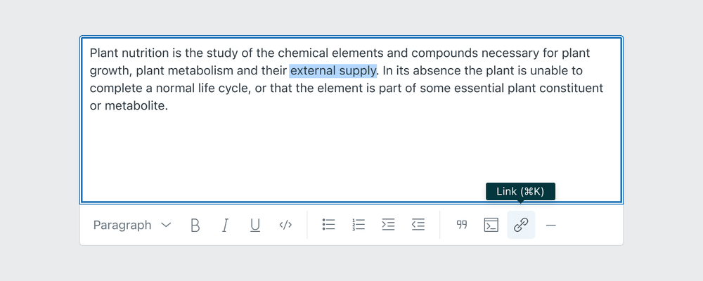
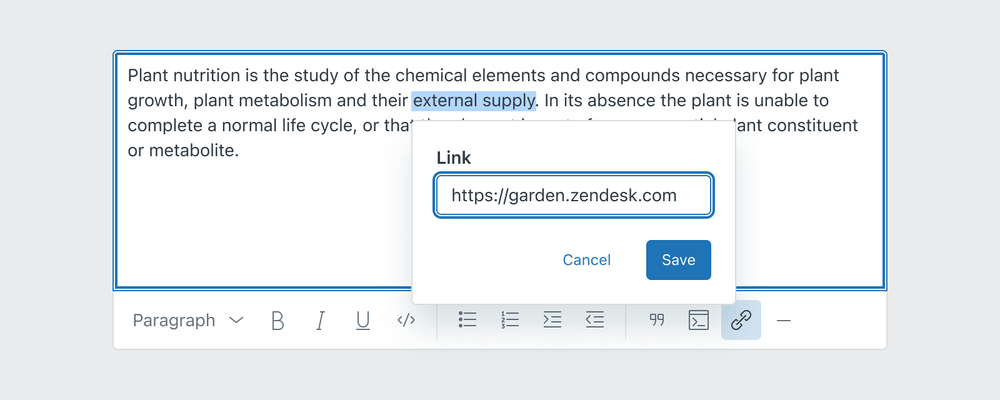
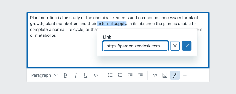
Inserting new link
New link can be added by selecting a text and converting it to a link with a shortcut or by pressing the button.
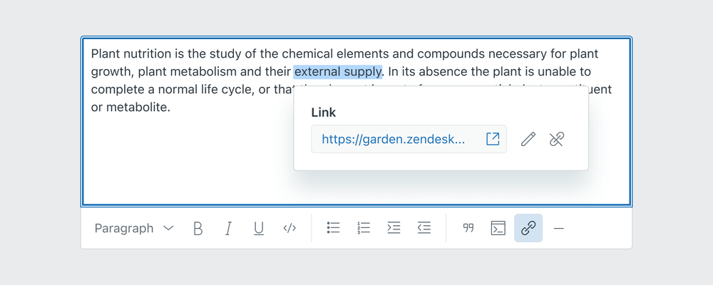
Editing link
Editing link tooltip dialog should give the user a choice of previewing the link and opening it in a new window, editing the link or breaking the link.
Localization
CKEditor offers user interface localization options and the translation system is opened to third-party plugins. Read more about it on the CKEditor localization support page.
Accessibility
Managing focus
When the toolbar is opened as a menu, the focus should be looped within that menu. This should be the case for all dropdowns in the toolbar.
- User selects the text they want to make bold
- Pressing tab will take them to the toolbar unless
Tabkey is reserved for indenting. In that case, a custom shortcut is used to move the focus to the toolbar. - The focus is then inside the toolbar until they pick an action or close the toolbar with the
Esckey. If textarea reserves the use ofTabkey for indenting lines, the user can use theLeft arrowandRight arrowto navigate within the toolbar. - Once the toolbar is closed, the focus goes back to its original position
If the editor has enabled indentation, the Tab key will be reserved for setting the indentation of the current line.
In those situations a custom text shortcut is used to move the focus from the editor to the toolbar: Alt + F10 on PC,
and Option + F10 on macOS. Read more about keyboard support.