Basic formatting
Tables display sets of related data across rows and columns. Tables make it easier for users to compare and analyze information.
Anatomy
Parts of a table

- Columns are vertical groupings of information that categorize and prioritize data
- Header rows describe the data provided in a column or row
- Rows are horizontal groups of data that fall under each column
Formatting
Size
Tables come in three sizes: small, medium, and large.
- Medium is the default size and accommodates information density in most cases
- Large is used when Avatars are introduced into rows to create additional breathing room between row content
- Small can be used when more information density is needed
Row heights

- Use a larger header row height compared to the body rows

- Don’t use the same heights for header rows and body rows
Layout
There are ways to design a table to make it easier to see and find information:
- A table must have at least 2 columns, otherwise use a List element
- Use horizontal lines to reduce visual noise in the table
- White space signals a different column
- You can specify max-width for columns but it’s not required
- Don’t place elements relating to the data outside of the table
Alignment
How text is displayed can make a column easier to view, use, and manage. Left align all text for greatest scannability, with some exceptions for quantitative data.
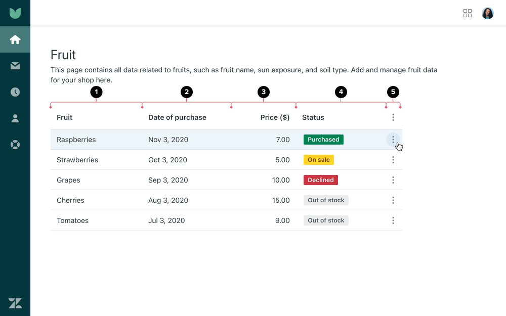
| Cell content | Alignment |
|---|---|
| 1. Text | Left align |
| 2. Categorical data that uses numbers (for example, dates, phone numbers) | Left align |
| 3. Quantitative data | Right align |
| 4. Tags or Avatars | Left align |
| 5. Icons | Center align |
Avatars, icons, and tags
Avatars
Avatars help represent a person or brand in tables. They can display icons or images.
Avatar sizes for tables include default and small.
- Use a small Avatar in a default table when more density is needed when displaying information about many users at once
- Default size tables with an Avatar have a starting height of 52px with 10px of top and bottom padding and 12px of left and right padding
- Use a default Avatar in a large size Table in contexts where the user data is the main object of the table, and if there are multiple items of metadata associated with the user
- Large size tables with an Avatar have a starting height of 60px with 10px of top and bottom padding and 12px of left and right padding
Icons
There are 2 types of icons that are used in tables: informational icons and icon buttons.
- Informational icons are icons that help communicate the state of the cell value. Informational icons must include
a
titleattribute andaria-labelto provide mouse and keyboard users with more context about the icon’s meaning. - Overflow buttons allow users to see additional table actions within an overflow menu
Tags
Tags let users categorize cell content using a keyword.
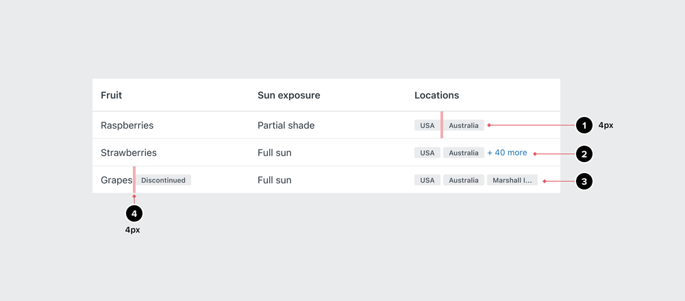
- The default size for Tags in table cells is small. Tags are left aligned with 4px of spacing between each tag.
- If there are more Tags than can be displayed in a cell, use a
ButtonwithisLinkprop. See Wrapping and Truncation for more information. - If a Tag exceeds the width of a cell, the Tag can be truncated. See Wrapping and Truncation for more information.
- Tags can be inline with other data about a user. The Tag should be inline with the data it is related to with the same 4px spacing between the data and Tag.
Wrapping and truncation
Text
Text wrapping is the default and recommended behavior. Ensure the cells in that row are top aligned to help with scannability. Keep in mind, truncation in a table can make it harder for users to scan. Use an Ellipsis to truncate long text at the end of the first line and provide a title attribute that appears on hover.
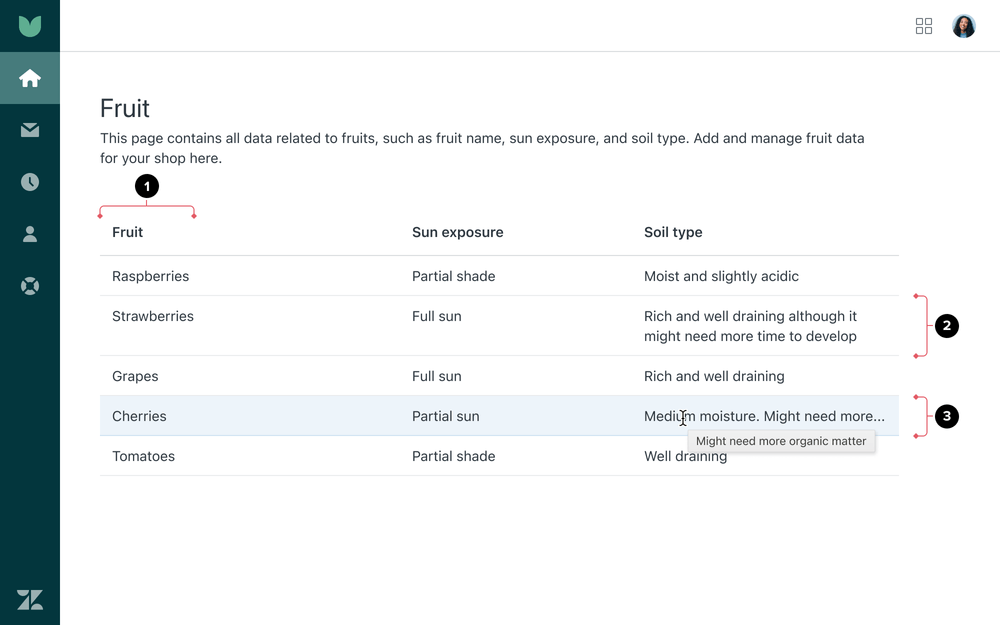
- Header and data cells should be concise
- Ensure the cells in the row are top aligned to help with scannability.
- Use an Ellipsis to truncate long text at the end of the first line and provide a title attribute that appears on hover.
Header cells
Headers categorize and organize the information within the table.
- Ensure header cells accurately describe the data contained in the rows and columns
- Use one or two nouns that quickly help people understand what data is in the table
- Avoid using verbs to prevent confusion with CTAs
- Header cell labels shouldn’t create sentences with data cell content
- Use sentence case
- Header cells are marked up with
<th>to make them accessible - Ensure visually-hidden header cell content is accessible for screen readers
Internationalization could result in text expansion. If the text length in a header cell exceeds the specified width of a column, there are a few options:
- Truncate with an Ellipsis
- Wrap the content. In the case of headers, content should be bottom aligned.
- Ignore the specified width and stretch the column width to accommodate the text. This could trigger horizontal scrolling for the table.
Data cells
Data cells contain the actual data and are located below header cells.
- Ensure the content is detailed yet concise
- Avoid repeating the words used in the header to help with scannability
- Use sentence case
- Data cells are marked up with
<td>to make them accessible
Tags
Truncation
Any tags that exceed the width of the cell, use an Ellipsis to truncate long text and provide a title attribute that appears on hover.

Overflow
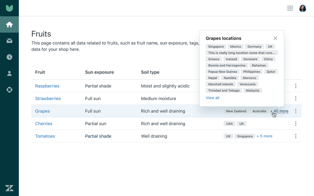
If there are greater than two tags, use a Button with the isLink prop indicating the
number of additional tags.
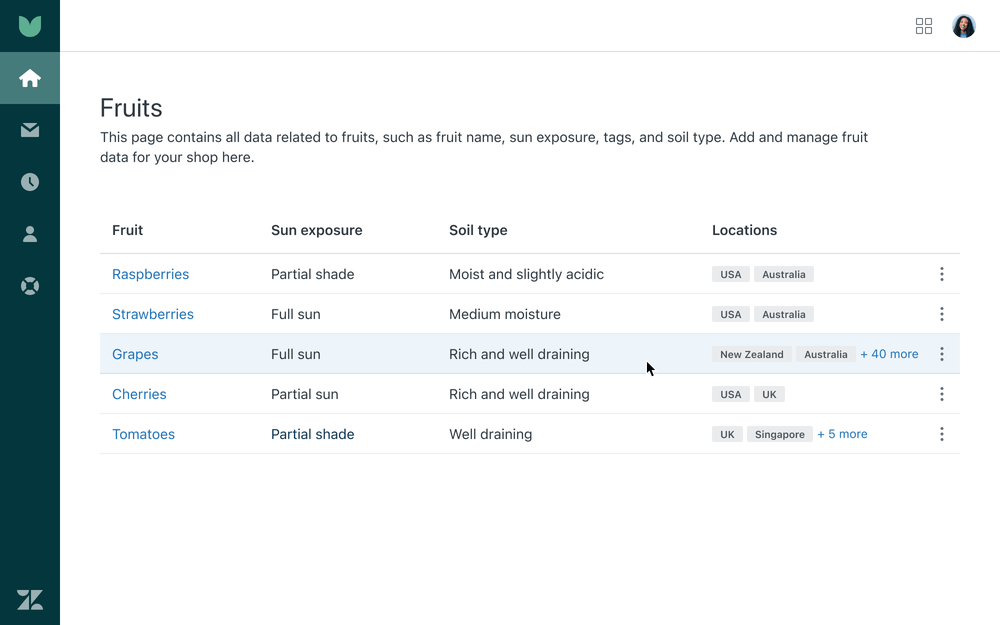
- When the user interacts with the button, it will open a Tooltip Dialog with
autoplacement set, ensuring it remains viewable within the viewport - When toggling the tag list, ensure the appropriate ARIA attributes are included
- For localization, create two strings for the button text: one for the ”+ {number}” and another for the “more” string
- If the number of tags becomes unwieldy within the Tooltip Dialog, include an action that allows the user to view all tag information in a separate view
Variations
Striped rows
If a table includes many rows of data, striped rows make it easier to keep their place when scanning horizontally.
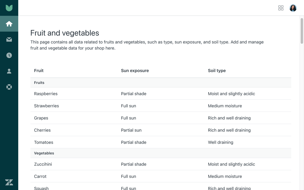
Grouped rows
When creating additional categorization of similar items, use grouped rows.
- They should be used only when the groups will contain 10 or more items
- Avoid overuse to prevent busy layouts that are harder to understand
- Don’t use striped and grouped rows at the same time
Row actions
There are multiple locations within a row to perform actions. Common actions include View, Edit, Delete or a combination of these within a single row.
- If linking to another page or a new tab, use an Anchor
- If opening a Drawer/Sheet/Modal in the same view, use a Button with the
isLinkprop
View and Edit
“View” or “Edit” actions are to be contained within the data cells of a row in addition to the overflow menu.
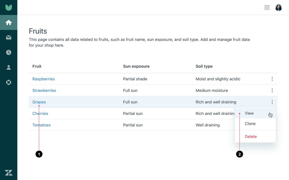
- The first “View” or “Edit” action is contained within the first column and will take the user to additional view or edit detail on that given item
- The overflow menu includes an additional “View” or “Edit” action, providing a second way to access the same content for viewing or editing
Additional actions
All additional actions are to be placed inside the overflow menu.
- Group complementary actions inside the menu, using separators to create visual hierarchy
- For destructive actions, place a separator line above the
menu item using the
isDangerprop

Screen readers
Ensure elements for the rows are clearly labeled and accessible.

Pagination
Pagination separates table rows into pages and allows users to navigate between those pages. Our table component is paired with the Pagination component to create a consistent experience.
- Cursor pagination is the default and recommended approach due to performance
- Cap a single page view at 100 rows
Cursor pagination
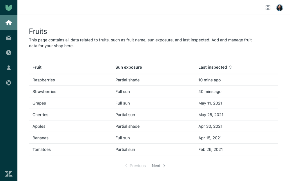
Use Cursor pagination for real-time data.
- This includes when new records are added frequently or in data sets where the latest results are first
- There is no concept of the total number of pages in the set
- Use “Previous” and “Next” as pagination labels
Offset pagination
Use Offset pagination when you know the number of records or where you are in the data set.
- Ensure the margin between the table component and the pagination is 20px
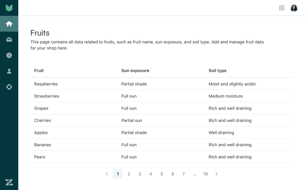
Select all for pagination
In paginated tables, you can select all checkboxes but that selection only affects the current page being shown.
- Users should only be able to take action on what they can see
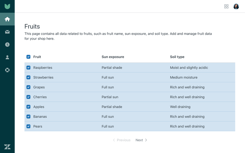
Infinite scrolling
In cases where the database supports infinite scrolling, there is no need to say how many pages of data there are. If you have an infinitely scrolling table, you should also offer sorting to help users navigate the data.
Select all for infinite scrolling
In infinitely scrolling tables, you can only manually select items.
Vertical scrolling
For tables with more rows than can be displayed in the viewport, the header row is fixed at the top of the viewport. Keeping the column headers within view while scrolling helps users maintain context.
Virtualization
Virtualization means what you see in the browser is what is in the DOM. When something scrolls out of view, it gets removed from the page DOM. When something scrolls into view, it is added to the DOM.
- Use react-window to efficiently render large data sets
Sorting
Sorting is implemented by selecting arrows in table headers.
- Clicking the header text will sort by ascending order (A→Z, 1→9, Date and Time, Priority (High→Low))
- Clicking again will reverse the order
- Clicking a third time will remove sorting
If any ordering is applied to a table including default ordering, the sorting icon should be present. This indicates how the table is being ordered and also creates a clear affordance to control.
Draggable
To have row reordering, you can apply drag-and-drop functionality with dnd-kit. For accessibility support, please read the dnd-kit guidelines.
Table caption
The Caption is the title of a table.
- A table must have a Caption or
aria-describedbyattribute that identifies the element which titles or describes the table
Anchors
Use an Anchor for data cell text elements that link elsewhere.

- These anchors within a table typically navigate the user to a new page
- If you want to open a link in an external window or tab, use an External anchor
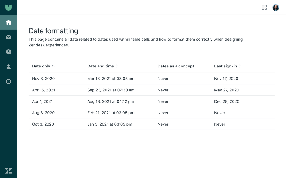
Date and time
Follow our date and time formatting guidelines.
States
Rows and cells

| Row/cell state | Additional guidance |
|---|---|
| 1. Empty cell | Cells with no values should be left blank. Do not use a hyphen, en, or em dash. |
| 2. Hover | |
| 3. Focused | |
| 4. Selected | |
| 5. Focused and selected |
Loading
Skeleton screens are used to indicate that a screen is loading. They are perceived as being shorter in duration when compared against a blank screen or a spinner.
- Implement the Skeleton component in each cell up to three rows
- For a table with three or more rows, show the first three rows as skeletons with the header cells being shown at all times to provide instant context of incoming tabular data
- The width of the Skeleton should match the width of the intended cell content, while the Skeleton’s height will be 60% of the font size
Localization & internationalization
Our tables have been designed to accommodate localization and internationalization standards so they do not break the experience.


Accessibility
General considerations
All Garden Tables are built with accessible markup.
Screen reader order
People using screen readers can have the row and column cells read aloud as they navigate through the table. Screen readers speak one cell at a time and reference the associated header cells, so the reader doesn’t lose context.