Filters
Filters are used to reduce the amount of visible data in a dataset.
- Overview
- General structure
- Formatting
- Selection methods
- Usage
- Behavior
- Localization & internationalization
- Accessibility
Overview
Filtering allows users to set specific parameters to reduce the amount of visible data in a dataset. There are two types of filters: basic filters and advanced filters. Basic filters allow users to make a few selections from predetermined parameters. Advanced filters allow users to set multiple filters; sometimes these filters are also configurable.
General structure
Both basic and advanced filter patterns are made using the same basic building blocks: an entry point, a container, and selection methods.
- Entry point
- Container
- Selection methods
Formatting
Entry point
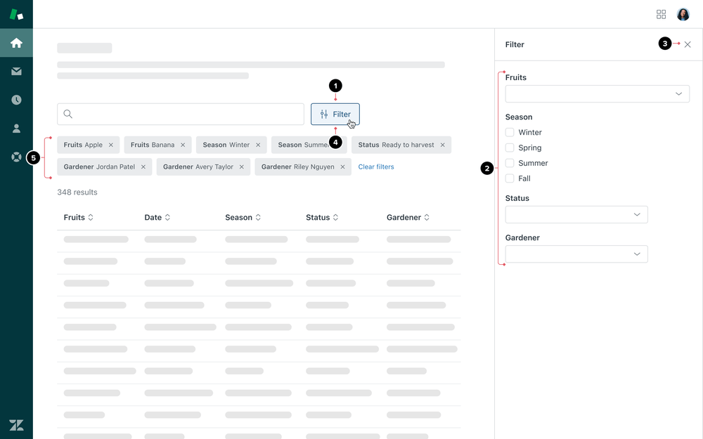
 The Filter entry point is the Button the user clicks to enter the Filter pattern.
- A Default Button should be used to open an Advanced Filter.
- A Media Button should be used to open a Basic Filter.
- An Icon Button should be used when the Filter pattern lives within a toolbar on the page, or to conserve UI space.
Location and spacing
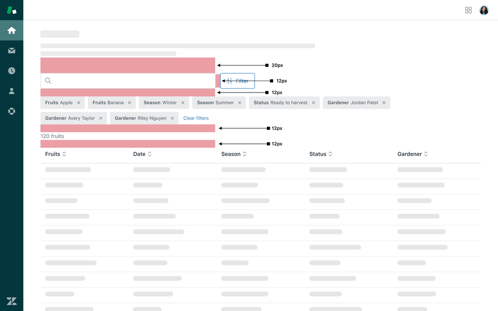
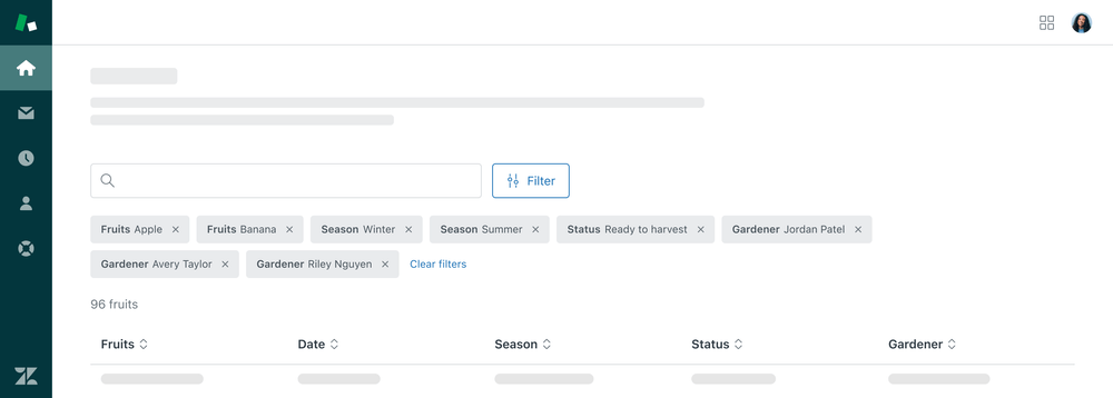
Filters are 20px below the page header and description. The Search bar and filter button have 12px of padding between them. Filters have 12px of padding below to allow space for Tags and 12px of space between the Tags and filter results. The filter results are 12px above the table.
To save space in a view, an Icon Button in a toolbar can be used to open a Filter.
Include a Tooltip to help any users who may be unfamiliar with the icon,
as well as a title attribute and aria-label.
Surfacing filters and results
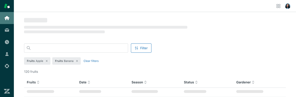
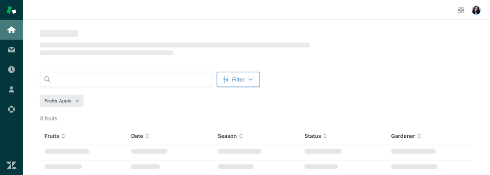
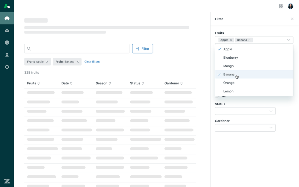
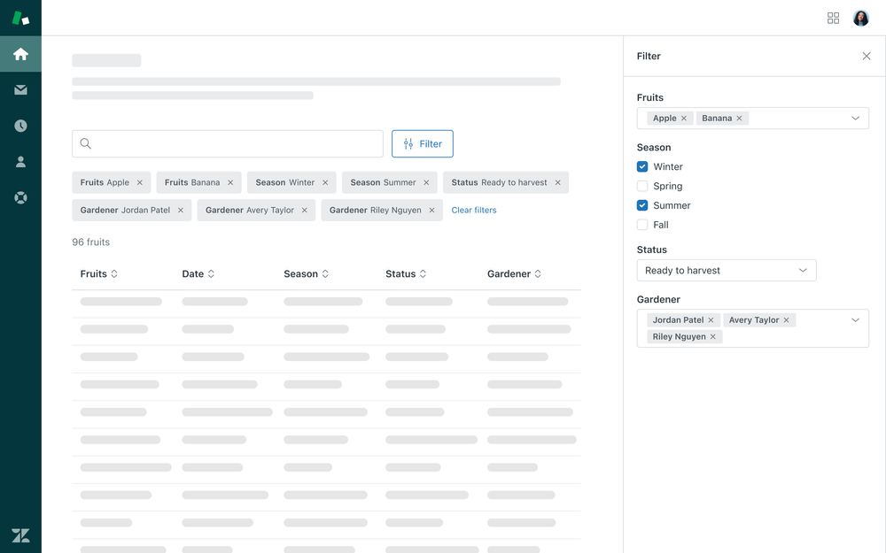
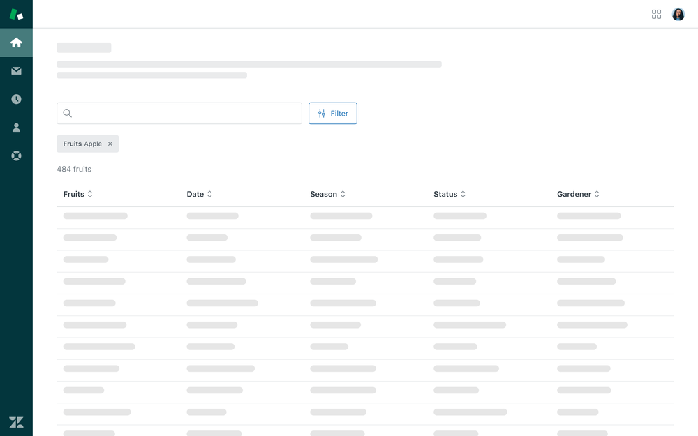
Filter parameters should be surfaced as Tags above the dataset they are filtering. The Tag content contains the filter parameter category in Bold, followed by the user’s selection in Regular weight. The number of results after Filtering should be visible to users where possible. The number of resulting data items should be displayed above the table below the filtering tags. For guidance on formatting loading states, see our Tables Basic Formatting pattern.
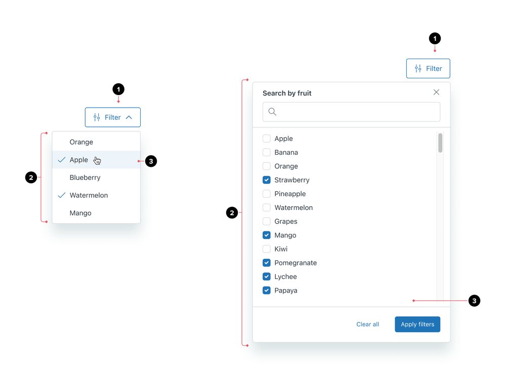
Selection methods
Different components are used depending on the type of selections a user is making to filter their dataset.
| Selection method | Description | Container |
|---|---|---|
| Single select | A user wants to use one category or subcategory to filter data | Menu |
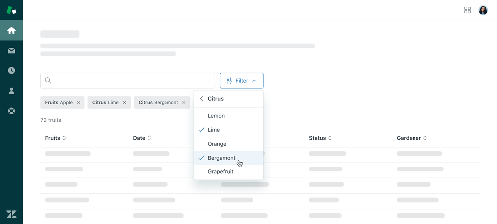
| Multiple selections, one category or subcategory of data | A user wants to use more than one selection to filter data | Menu that allows for multiple selections |
| Multiple selections, few categories of data | A user wants to use multiple selections within different categories to quickly filter data | Nested menu |
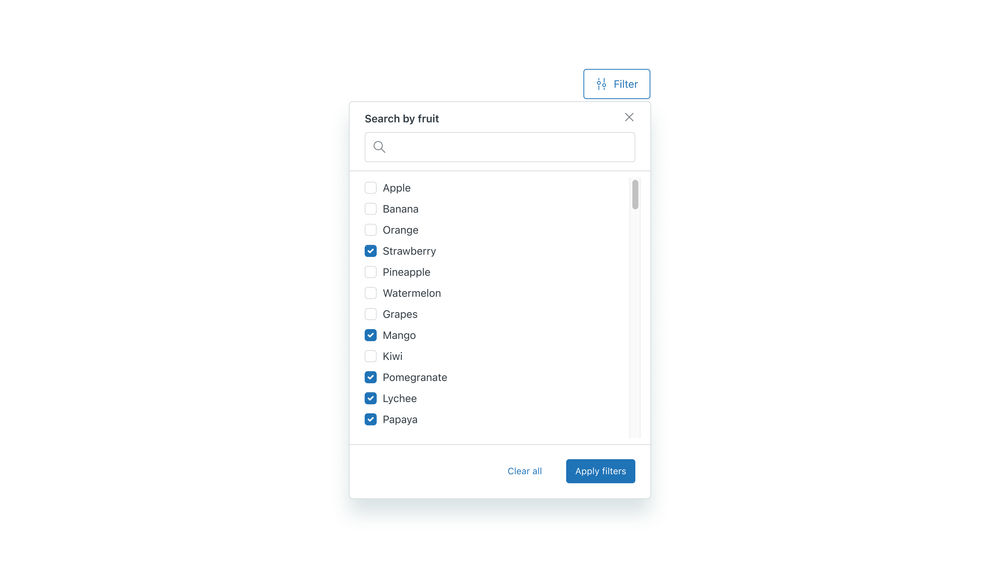
| Multiple selections, one category with many options | A user wants to be able to search options and use multiple selections within a large set of options to filter data | Tooltip dialog |
| Many categories, live updates | A user wants to set multiple filters across a dataset with many categories and see their dataset update live | Sheet |
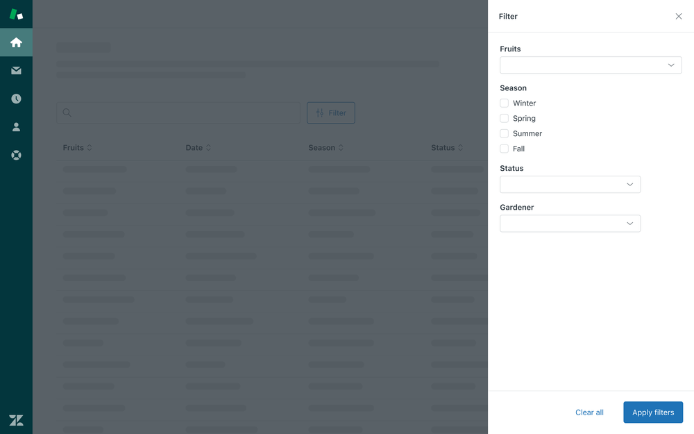
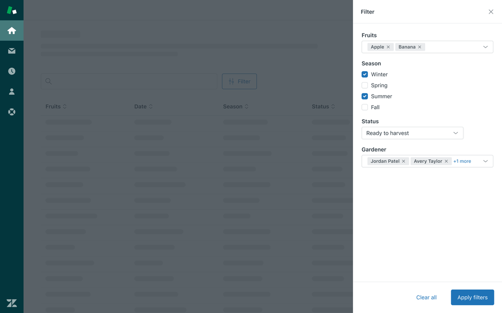
| Many categories, batch updates | A user wants to set multiple filters across a dataset with many categories and apply them all at once | Drawer |
Usage
Basic filtering
Basic Filters allow users to filter a dataset through one category with only a few options.
Single select
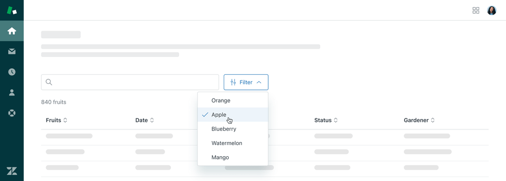
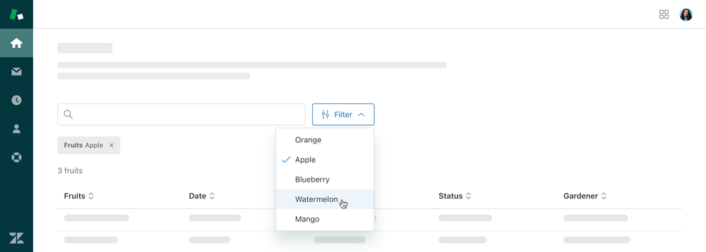
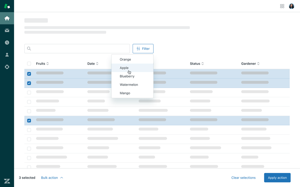
Single select basic filters use one selection to filter data. Upon the selection, the Menu closes and the filter is surfaced as a Tag. Selecting another menu option replaces the current Filter with the new selection.

Multiple selections
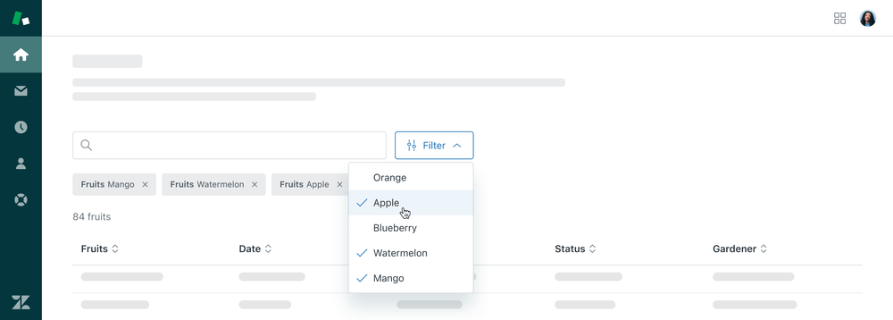
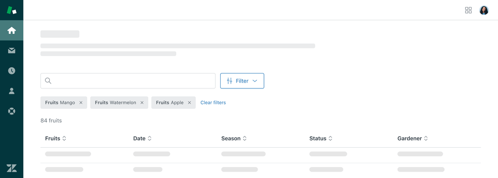
Multiple selection basic filters use multiple selections within a category to filter data. The Menu remains open as the user makes their selections. The selections are surfaced as Tags with a Basic Button to clear all filters.
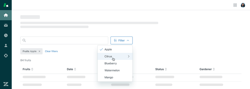
Nested menu
A Nested menu can be used to organize subcategories of data that can be used to filter a dataset.

Advanced filtering
Advanced Filters allow users to set and configure multiple filters on a dataset.
Tooltip dialog
A Tooltip dialog allows users to filter a dataset through one category with many options, and allows the user to search for specific options. They can also be part of a more complex flow.
Sheet
A Sheet is used when the dataset is filtered live as the user makes their selections. Selections are surfaced as a Tag as the user sets each filter.


Drawer
A Drawer is used to batch apply multiple filters at once. Selections are surfaced as a Tag after the user applies their filters and closes the Drawer.
Behavior
Bulk actions
When items are selected in a table and a filter is applied, the Filter overrides the selections and deselects them.
Localization & internationalization
RTL right-to-left
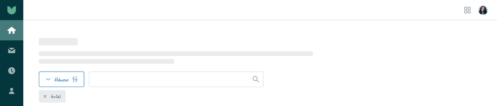
Filter entry points are mirrored for RTL languages. For more information about RTL considerations, see our Buttons pattern.
Accessibility
Tabbing order
- User opens the filter container
- The focus moves to the first filter category and continues through all categories.
- Focus moves to close filter. Filter can also be closed with the
esckey. - Focus returns to Filter trigger button.
- Focus moves to the first tag after container is closed.
Affordances
Additional affordances should be included to ensure users are aware of the filters applied and the results of those filters. Screen readers should read out the results of a filter after the filtering actions are completed.