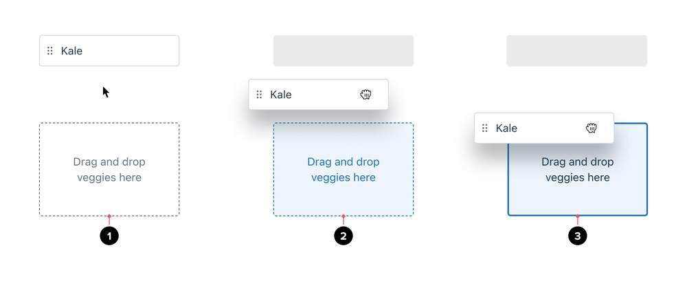
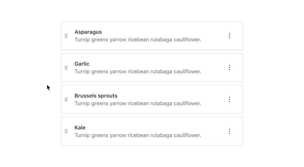
Drag and drop
Drag and drop pattern is often used to change the order of items in a list or to move and organize items between lists.
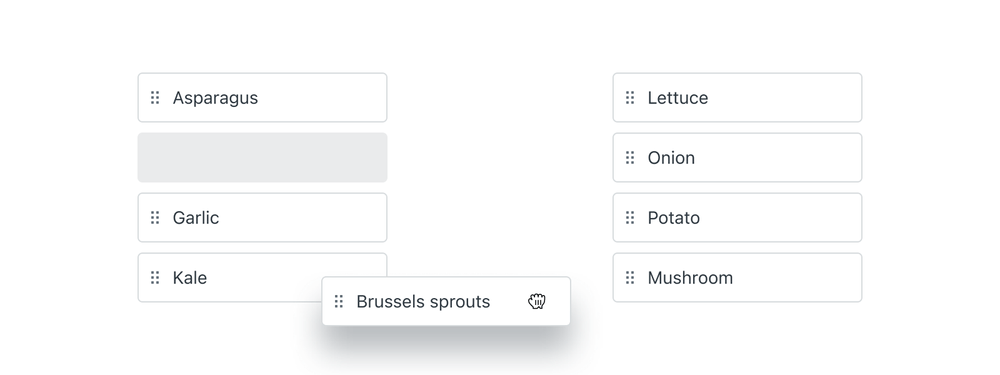
Anatomy
Drag and drop interaction is common in workflows where the user wants to change the order or of items. It is also often used to build something by moving items around the screen, for example, a layout, report, or dashboard.
- Draggable grip
- Target placeholder as whitespace
- Draggable item being dragged
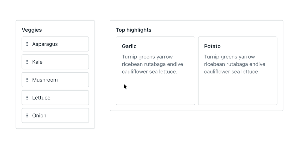
Drag and drop between lists puts more emphasis on dropzones and source placeholders.
- Draggable item
- Dropzone
- Source placeholder
- Dropzone active
- Dropzone highlighted
- Draggable item released
Related components
Formatting and States
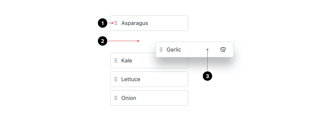
Draggable item
The grip handle and border define the default Draggable item. Draggable items should have labels that are short and easily identifiable. Sometimes these are user-generated so the length may vary. The grip icon provides a visual affordance to communicate drag-and-drop. Border communicates the boundaries of a draggable item. Draggable items with many interactive elements can restrict movement to the grip handle only.

- Default state communicates what is draggable
- Grabbed state communicates the item moving
- Disabled state communicates a non-interactive item
Dragging larger items
Items can include other interactive elements inside them, such as buttons, anchors, or even form elements. Nested elements will make the parent element taller and harder to interact with. Instead of making the item transparent, transform it into a simpler draggable item while dragging.


- Provide a simpler preview of a draggable item while dragging

- Don’t make draggable items transparent during dragging
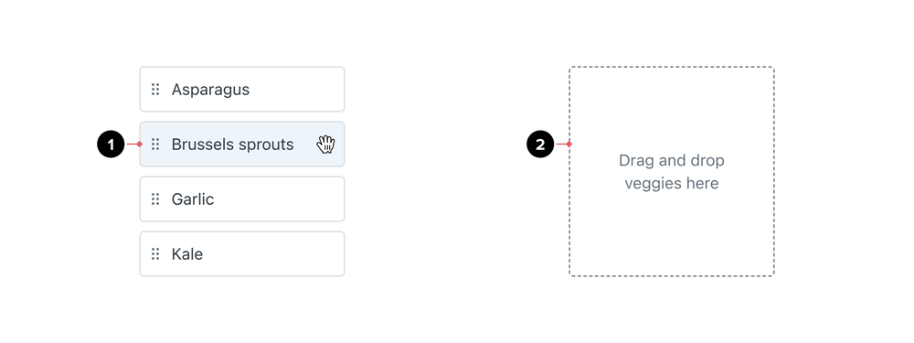
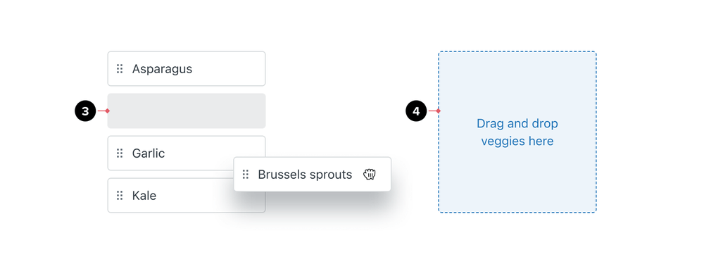
Placeholders and indicators
Placeholders and indicators are visible during the drag-and-drop interaction. They show where grabbed items can be placed.
When to use which
Use empty placeholders for most basic drag and drop interactions, such as reordering items within a single list.

Use a solid grey placeholder when moving items between many lists, to show where the item originated and where it is going.

Use target indicators when working with complex layouts where you don’t want to transform
the layout before releasing the item.

Placeholders
Placeholders and indicators appear during the drag-and-drop interaction. They show where you can place a grabbed item.
- Use empty space placeholder to show the source or target destination when reordering items
- Use a solid grey placeholder to show the source and target destination when moving items between lists
- Use a disabled state to show that the source item will copy to another list
Target indicators
Target indicators show where dragged items will appear upon release. Use them in condensed layouts or when you don’t want to transform the list while dragging.
- Use a vertical indicator to communicate placement between items in a row direction list (left to right)
- Use a horizontal indicator to communicate placement between items in a column direction list (top to bottom)
Dropzones
Dropzones are locations on the screen where the item can be moved onto. For flat structure lists, the dropzone is usually the list container. In complex workflows, dropzone might be another list — flat or nested, or even another item. Dropzones can be communicated in several ways, by using dashed borders, labels or a task-oriented context of reordering or building something on the screen.
Border treatment
- Use
1px grey-600border to show empty default dropzones - Use a dashed
1px blue-600border to show active dropzones where grabbed items can be placed - Use solid
2px blue-600border to communicate a highlighted dropzone
Text and icons
Dropzones, like good empty states, should explain how to interact with it. Sometimes, the content in the dropzone will appear after the user drags the item so only “drop” is mentioned in the content. Include the consequence if it’s important for the user to understand what will happen when they drop the item in this dropzone. Content, together with supporting icons and colors will make the user confident in the end result.

- Default dropzone without icon
- Danger dropzone with a theme and icon applied
- Highlighted dropzone with a custom icon
Use icons to reinforce the labels when needed. Hide decorative icons from assistive technologies.
Empty and populated dropzones
Use borders and labels to make empty dropzones discoverable. Keep populated dropzones simple by showing only items inside. Always provide the label for screen readers, even if it’s not visible on the screen.

- Include content that will explain how to interact with the empty dropzone
- Populated dropzones don’t need a supporting call-to-action
Dropzones as items
Provide visual affordance when items are both draggable and potential dropzones.

- Item with default styling
- Item as an active dropzone with a dashed border
- Item as a highlighted dropzone
Flows
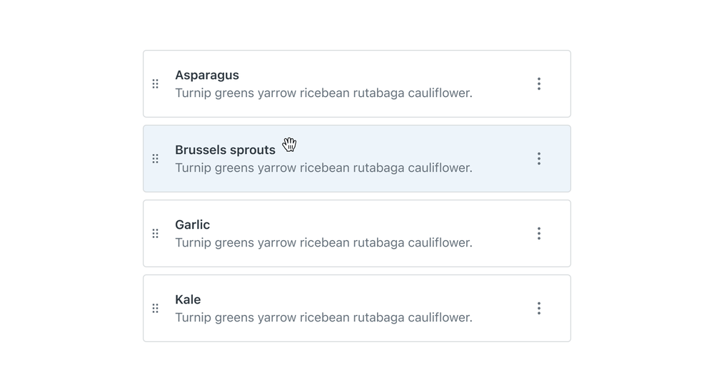
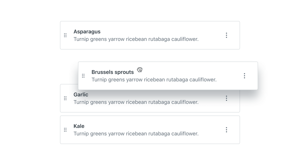
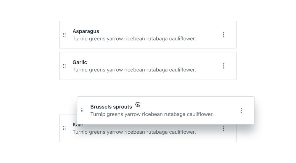
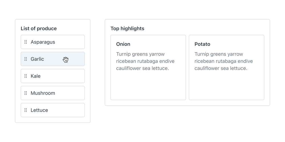
Reordering a list
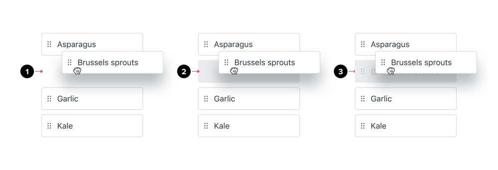
This is the most basic example of drag-and-drop. Interaction is discoverable through a grip handle on the item. See draggable tables for reordering rows.
Once the item is grabbed, empty space proportional to the grabbed item will communicate where the item will be placed after release. The dragged item should follow the cursor around the screen without any delay.
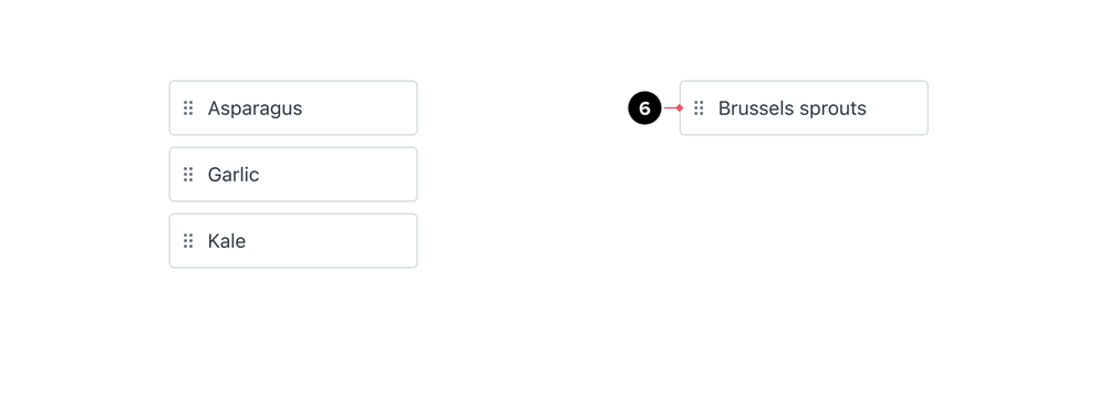
Once the item is released on the desired location, the movement is instantaneous. If the item is released outside of the dropzone container, it snaps back into its original place.
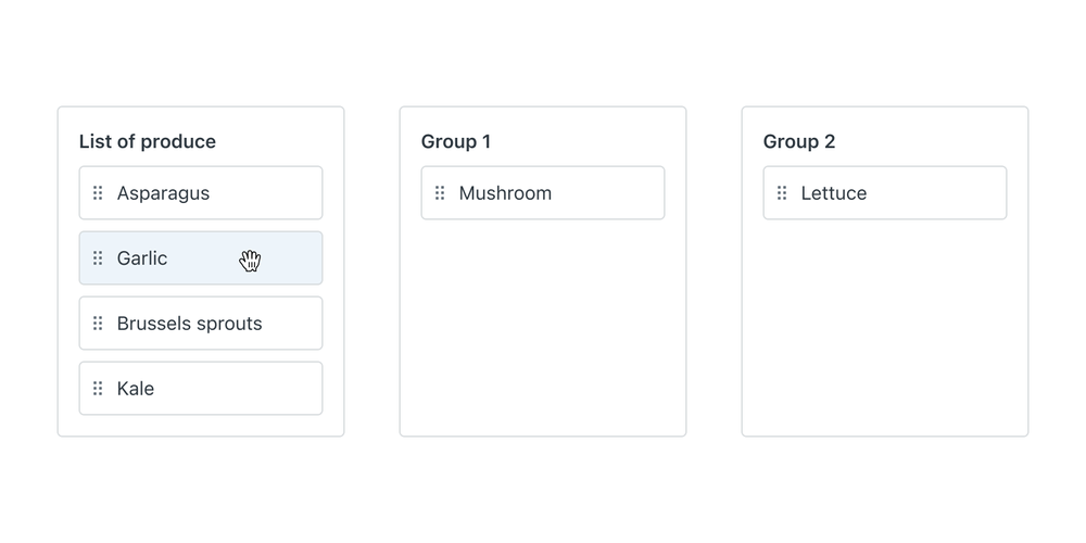
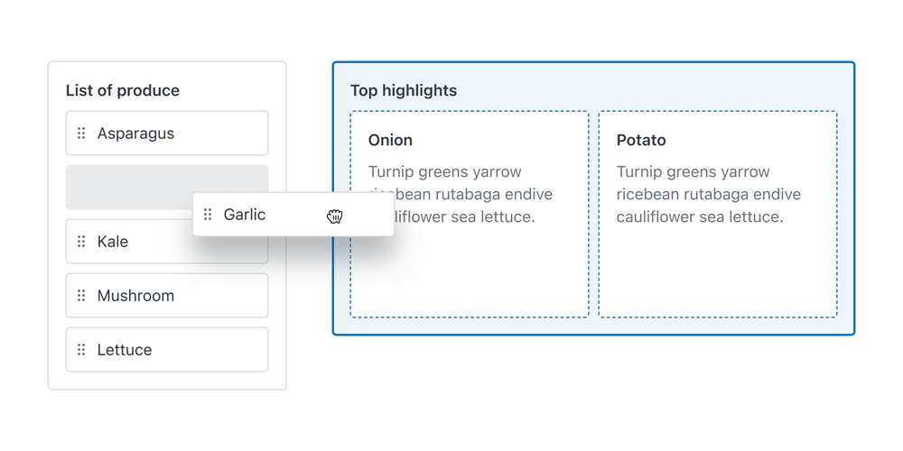
Moving items between multiple lists
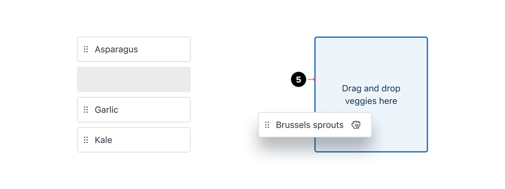
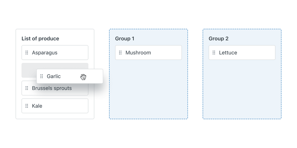
Moving items between lists usually happens when there is a need to quickly categorize items into different groups. This experience is quite common in a Kanban-like context or in a builder workflow. Use content and styling to highlight dropzones that can receive items.
Highlight active dropzones while an item is being dragged. Use highlighted styling to show which dropzone will receive the item after release. Use solid grey placeholders to communicate where the interaction originated and where it will end up.
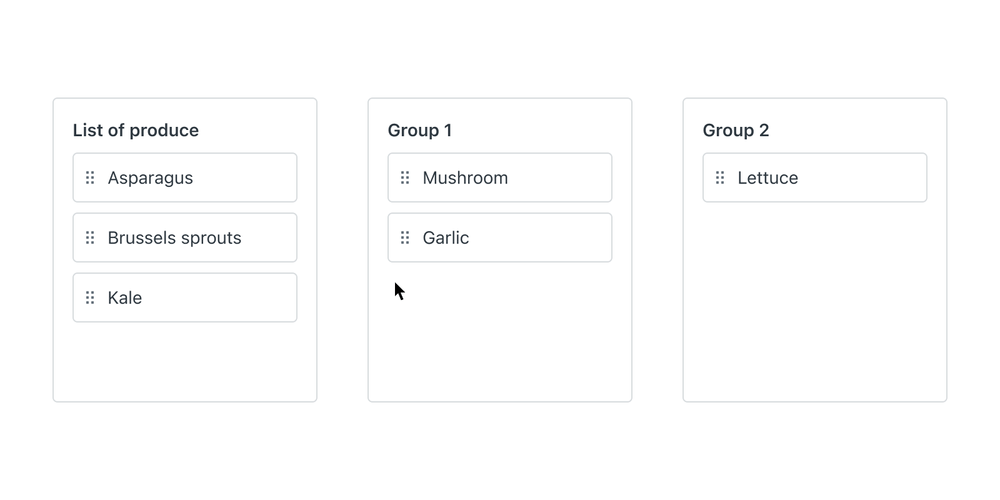
Upon release of the item, position it at the end, unless the user specified a place in the list. Communicate to the user if the change will be saved immediately or through a page-level save action.

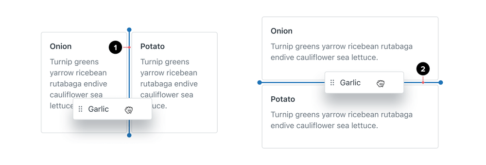
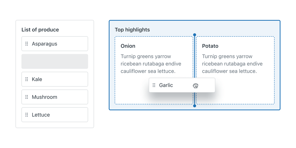
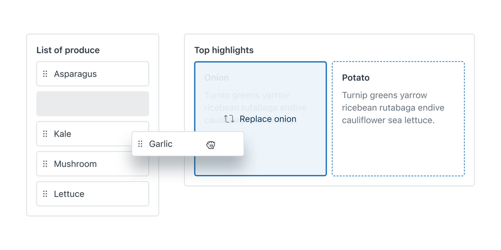
Moving an item onto an item or a list (nesting or replacing)
Drag-and-drop provides a quick way to do several things at once. Change the order and hierarchy of items, nest, delete and replace items.
Use target indicators to avoid transforming the list before release. Target indicators help the user understand where the item will be placed before they commit to the action by dropping the item.
Use a solid grey placeholder state to communicate where the grabbed item originated. Highlight active dropzones that can receive the grabbed item. Show indicators in the place where the grabbed item will appear after the drop.
Show the item instantly in the target location. Item will transform the layout or adapt to the constraints of the container. Use text and icons to communicate the intention, such as nesting or replacing.

Predictable drop behavior and collision algorithms
Collision algorithms allow control over how to detect collisions between draggable items and dropzones. Depending on the complexity of the drag and drop experience, some algorithms are preferred over others.
Closest center
Use the closest center algorithm to find the closest dropzone whose center is closest to the center of the draggable item. This is more forgiving as it allows for dropzone collision without intersection. The closest center algorithm is the recommended default for most use cases, like simple sortable lists.

Closest corner
The closest corner measures all four corners of the draggable item and dropzone and finds the closest one. Use the closest corner algorithm when there are many dropzones in the condensed interface. This behavior is most aligned with what users would expect.

Rectangle Intersection
Use the rectangle intersection algorithm when there needs to be an intersection between an item and a dropzone. This algorithm is less forgiving but more precise. Use it in dropzones for destructive actions to prevent mistakes.

Localization & internationalization
Grip handle location
Place the grip handle on the left side for LTR and on the right for RTL languages. The Draggable item component provides automatic language direction support.
Hidden labels or descriptions
Some labels or descriptions could be hidden or appear only in certain parts of the interaction. They support assistive technologies, like screen readers, and need to be localized as well.
Accessibility
Keyboard controls
Provide consistent keyboard controls for non-mouse users:
Spacekey selects the focused item, or releases the item within a different dropzone containerUpandDownarrows keys change the position order of a grabbed item within a single containerLeftandRightarrow keys move the grabbed item between different containers on the screen. SwapLeftandRightbindings to match the LTR or RTL direction- If the workflow supports Undo and Redo actions, those should work for the drag and drop interaction
Esckey cancels movement of the grabbed item and returns it to the original position
Screen readers
Announce all states of the drag-and-drop interaction to screen readers. Ensure items and dropzones have distinct labels. Screen readers should communicate focus, selection, change of order, or dropzone change if moving between lists.
Alternative ways to drag-and-drop interaction
Complex workflow might provide alternative ways of moving items around, to supplement the drag and drop behavior. Alternative actions, like buttons, might be placed next to the Draggable item to provide a different way of moving the item to another list. These situations should be evaluated on a case-by-case basis as they rely heavily on the workflow context. What makes sense for one flow, might not make much sense for another.