Buttons
A button is an element on a page or view that tells a user what they can do and triggers an action.
Anatomy
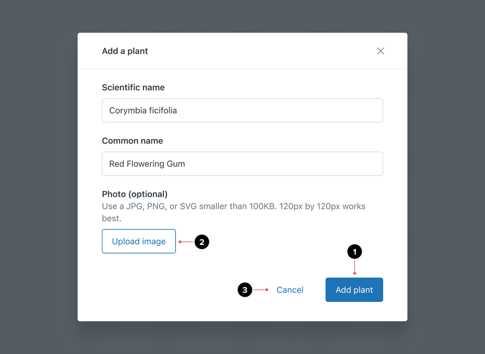
- Primary buttons are for the most important action in a given view. Use one primary button per page or view.
- Default buttons are for secondary actions
- Basic buttons are for repetitive or deemphasized actions in a given view
Formatting
Size
Button size plays a part in content and user interaction. Clear labels and visual signifiers such as shape, color, and size help communicate the types of actions available and their priority in the process.
- The default button size is medium
- Use small buttons on screens that have greater information density
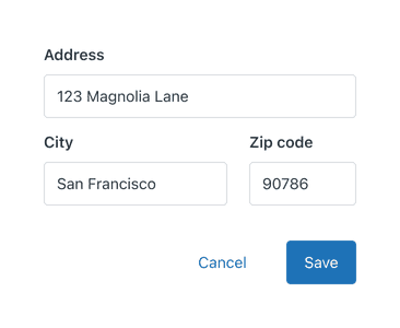
- Use same size buttons and inputs in the same flow
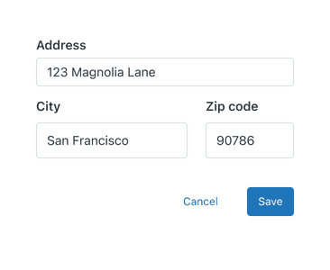
- Avoid mixing and matching button and input sizes
Alignment
When a basic or default button is placed in conjunction with a primary button, the primary button should always be placed at the end.
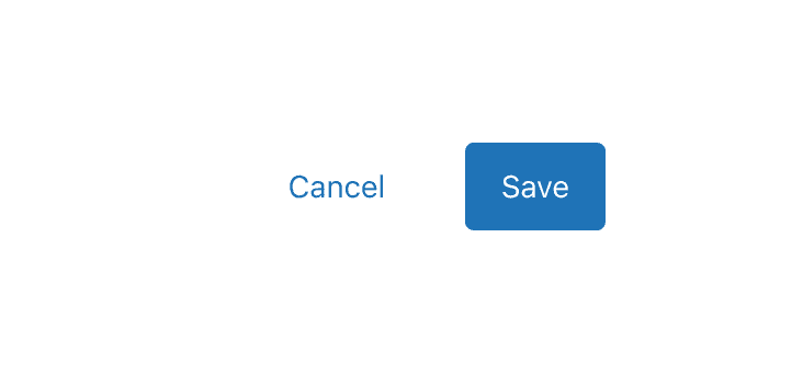
- Ensure the primary button is placed at the end of the set of actions
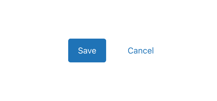
- Avoid placing primary buttons at the start of action groupings
Variations
Media
Buttons can contain media iconography positioned at the start or end, to provide additional context. Only use icons when necessary.
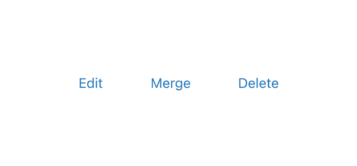
- Use task-specific verbs for button labels
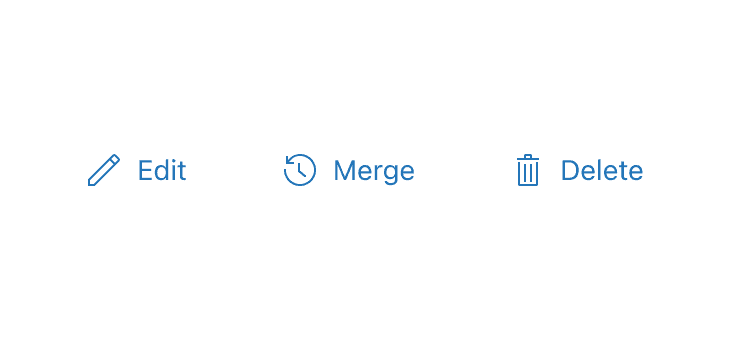
- Do not use iconography in addition to labels when buttons are grouped
Icon buttons
Where possible, avoid using Icon buttons over Buttons with labels.
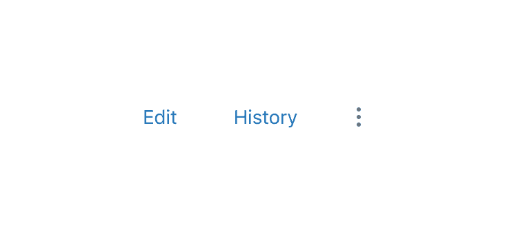
- Use buttons with labels to maximise inclusivity when using primary or secondary actions

- Avoid using icon buttons as primary or secondary actions where possible as their meaning can be open to interpretation
States
Loading
Loading buttons display a Dots loader inside the button to show loading progress. The Dots loader appears after the user has initiated an action, signifying the site is loading the next action to occur. Buttons shouldn’t change size while loading.
Disabled
A disabled button prevents user interaction. They don’t appear in the tab order, can’t receive focus, and may not be read aloud by a screen reader.
If a button action might result in an error, it is preferable to show an error message than to disable the interaction altogether. Error messages can at least guide the user’s next action, while a disabled button provides no useful information. It can be frustrating if a user doesn’t know what mistake they made and how to proceed.
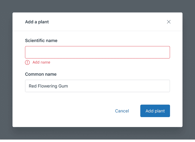
- Always keep buttons interactive
- Add contextual, in-line error notifications that set people up for success
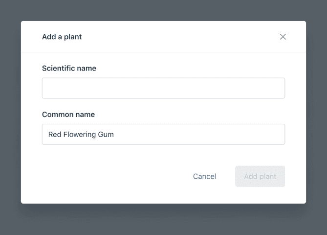
- Do not disable a button with no clear direction on how to move forward
Flows
Buttons vs Anchor (links)
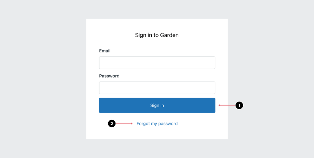
- Buttons trigger an action on a page or view
- Anchor (links) help users navigate from one location to another
Content guidelines
The button call-to-action (CTA) should guide the experience, not just finish a page. Typically, the CTA repeats the page heading when possible (e.g. “Add agent”). The phrase repetition confirms the action that will take place.
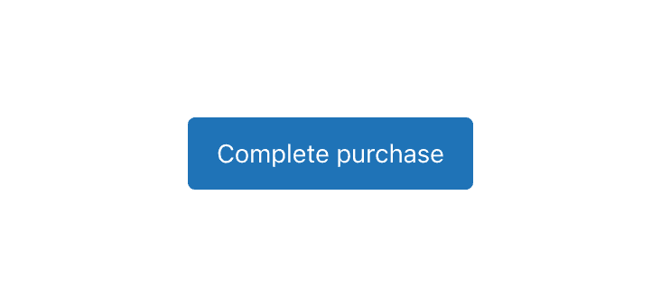
- Write labels as verbs
- Communicate a single action per button
- Use sentence case
- Consider longer languages. Use 1-4 words and a maximum of 20 characters
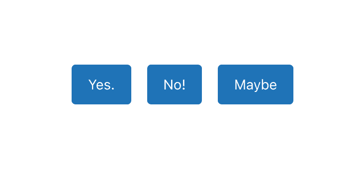
- Avoid CTAs that lack context like “Yes,” “No,” or “Maybe”
- Avoid calling out more than one action
- Avoid ALL CAPS
- Avoid articles, pronouns, and punctuation
For more help with choosing the right verb, visit our actionable language guidelines.
Localization & internationalization
RTL (right-to-left)
Actions need to accommodate different languages (making them wider or shorter) and both left-to-right and right-to-left direction. Keep in mind that the width of your actions will change and act accordingly.
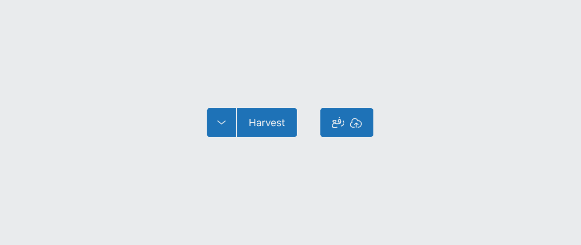
For RTL languages, the layout of the button is mirrored. Split buttons will automatically switch places for dropdown and label, whilst media elements such as icons will be placed on the right side of the text.
Accessibility
Keyboard support
Users must be able to activate a button by pressing Enter or Space while the button has focus.
ARIA attributes
Buttons can have different states that benefit from ARIA attributes. Assistive technology will communicate these attributes to users, providing users with important context for and information about the user interface.
Toggle buttons
Toggle buttons utilize the aria-pressed attribute indicating the current “pressed” state.
The attribute must be set to “false” when the button hasn’t been pressed, and then change to “true,” once it has.
Icon buttons
Icon buttons utilize the aria-label attribute to provide an accessible text label
for the icon. Ensure the label is appropriately localized on implementation.
Dropdown buttons
When utilizing Dropdowns that leverage Buttons,
the aria-expanded attribute is set on the Button to indicate if the Dropdown menu is expanded or collapsed,
and whether or not its child elements are displayed or hidden.
The attribute must be set to “false” when the menu is closed, and then change to “true” when the menu is open.
A Button that opens a Dropdown menu must also have aria-controls set to the id of the expandable menu
and aria-expanded set to the current state of the menu.
Finally, a Button that opens a Dropdown menu must have aria-haspopup set to “true.”
Additional resources
- https://developer.mozilla.org/en-US/docs/Web/HTML/Element/button#accessibility_concerns
- https://developer.mozilla.org/en-US/docs/Web/Accessibility/ARIA/Attributes/aria-pressed
- https://developer.mozilla.org/en-US/docs/Web/Accessibility/ARIA/Attributes/aria-expanded
- https://www.w3.org/WAI/ARIA/apg/patterns/button/
- https://inclusive-components.design/toggle-button/
- https://inclusive-components.design/menus-menu-buttons/