Error handling
Error messages let users know that a problem has occurred and what to do about it.
Examples of errors include:
- The system has failed to load or perform an action
- The user has made an incorrect action or input
Error messages are best surfaced using these components:
Global Alerts
Use the Global Alert to communicate system level errors that interrupt a user’s task.
Anatomy
- Always include a title to explain what has went wrong and how to fix it
- Provide a clear action to address the issue
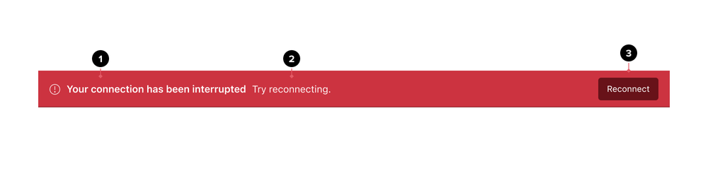
- The Title announces what has went wrong
- The Content area describes how to address the issue. It may include an anchor to provide additional information
- This Button provides a way to resolve the error. This button is placed towards the end of the Global alert
Layout
Global Alerts sit above chrome and push all page content down. They are the first item seen and announced by screen readers. For errors, Global Alerts should be persistent until the issue has been resolved by the user or system.
Examples
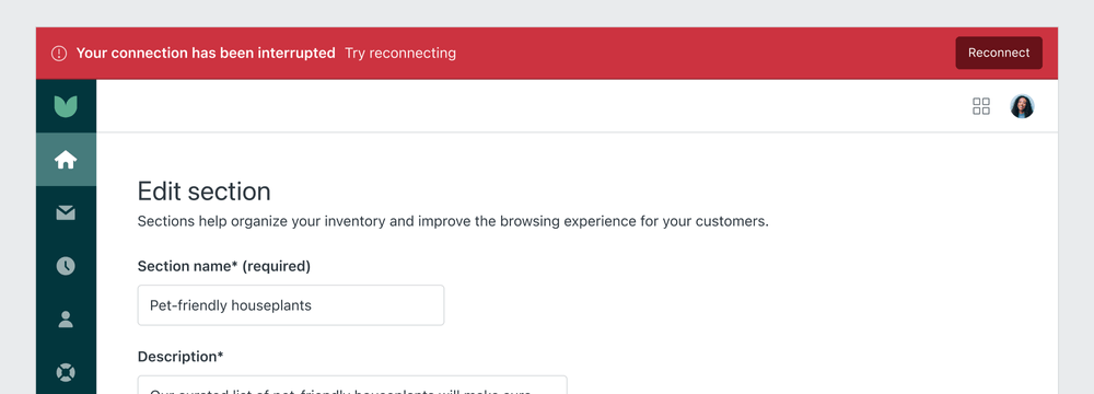
Disconnection
Use the Global Alert component to communicate that users have lost the connection to Zendesk. Provide a button to allow users to reconnect. There is no close button as the alert should only be dismissed when the connection is restored.
Alerts
Use alerts to communicate contextual information on how to fix an error. They persist until they are dismissed by the user or the issue is resolved. They are most commonly used in conjunction with validation messages in forms.
Anatomy
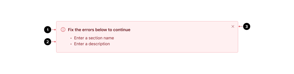
- Title
- The Paragraph area describes in more detail the error and how to fix
- The Close button is an icon button, at the end of the Alert
Layout
Alerts appear near their related items. They can expand to fill the width of the container or area they are in.
In conjunction with forms

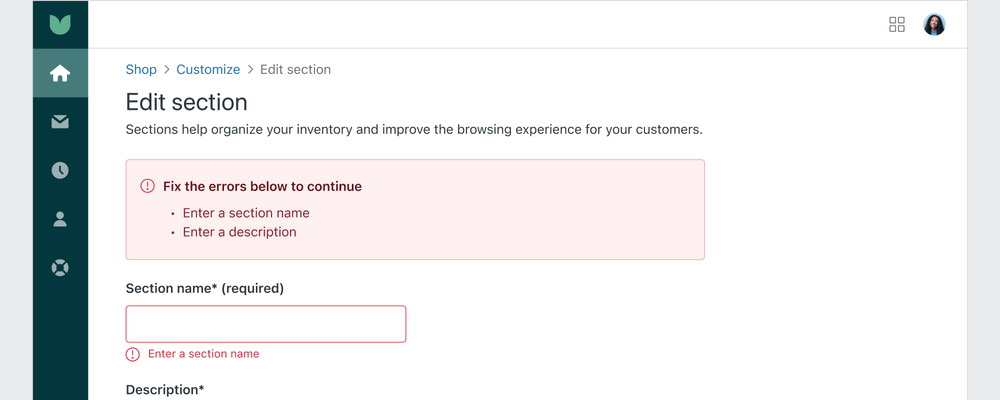
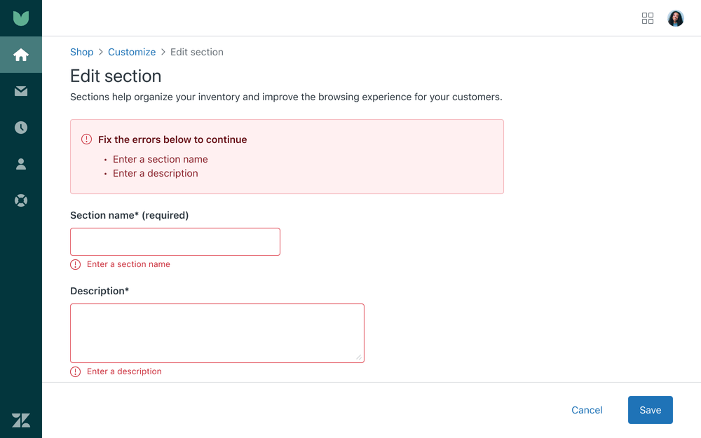
- An Alert at the beginning of the form to summarize what went wrong
- Each individual form input with errors is highlighted
Notifications
Use error notifications when an activity can not be completed.
Anatomy

- Title
- Message
- Close button
Layout
Notifications should sit on the top right side of a workspace and remain on screen for at least 5 seconds. Avoid covering important elements.

Examples
Failed actions
The notification component helps communicate that an action could not be completed.

- An error notification appears at the top right of the screen indicating that the user’s image could not be uploaded
Forms
Use the message component to help users correct input errors as they happen. Clearly explain how to fix the error.
Anatomy

- The input field’s border turns red to indicate an error
- Provide a detailed error message to describe what went wrong
Layout
Multiple form errors
For multiple form errors, provide inline error messages for each. Also provide an Alert at the top of the form, listing a summary of the fields that need correcting.
Formatting
Validate on submit
Use validation messages after submission to reduce interrupting users as they move through forms. Live validation should be used sparingly (i.e. severe errors, passwords, emails).


- Show error validation after the user has tried submitting the form

- Do not use live validation
Keep data the user has entered
Keep incorrect values that users have entered to help them avoid making the same mistake twice.

- Keep invalid data to let users understand what to correct

- Do not clear invalid data
Accessibility
Error messages need to be perceivable and understandable for people of all abilities. An accessible error message should exhibit these qualities.
- Written in text. Icons and color can be used, but not alone.
- Close to the element that triggered the error
- Informative, helping the user resolve the issue
- The message should refer to the failed element in code
Additional resources
https://www.w3.org/WAI/standards-guidelines/act/rules/36b590/proposed/ https://www.w3.org/WAI/WCAG21/Understanding/error-identification.html https://www.w3.org/WAI/WCAG21/Understanding/error-suggestion.html